- Creative Director
Role
On the Thrift project, I collaborated with the project owner on strategy, establishing the brand identity, and oversaw the UI/UX design for both the mobile app and the desktop retailer portal. My responsibilities included conducting competitive research, executing UI/UX design to enhance user engagement, and directing a team of designers to ensure a cohesive visual language across platforms. A key aspect of my role was the redesign of the GroceryPress retailer portal, aligning it with Thrift’s aesthetic and improving its UX. I created an intuitive, breathable interface for each product, emphasizing the brand values of growth, prosperity, and longevity, and ensuring the design’s appeal to our target audience.
Disciplines
- UI
- UX
- Design Systems
- Brand
- Visual Design
Skills
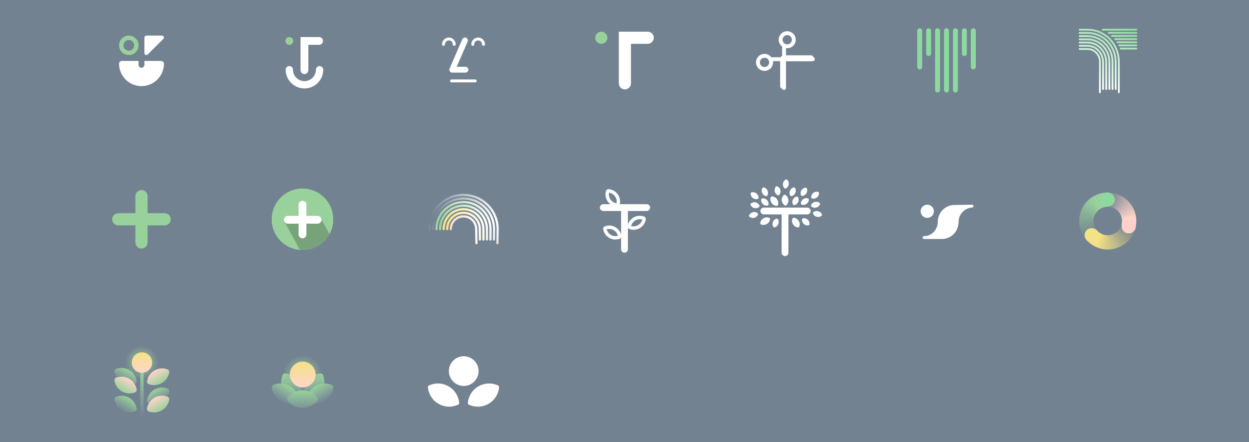
- Iconography
- Illustration
- Prototyping
Surfaces
- Desktop
- Mobile
Team
- Project Owner
- Junior Designers
Project Length
- 13 Months
Deliverables
- Market Research
- Design Explorations
- Design System
- Guidelines
The Problem
The existing app (GroceryPress) functioning as a white-label coupon platform, was facing issues with scalability, customization, and user experience. The key challenge was to redesign and rebrand the app to not only enhance its UI/UX for retailers and consumers but also to make it more scalable and cost-effective for the company. This involved removing the resource-heavy internal process of customizing an app for each retailer and creating an app that would house multiple retailers.
The Results
The work on the Thrift Mobile Coupon App led to a successful beta launch. User feedback was overwhelmingly positive, seeing a 30% increase in user interaction compared to the previous GroceryPress app. The rebranding efforts, particularly the unified aesthetic of the retailer portal and the mobile app, were well-received, enhancing retailer experience and aligning with the new brand identity. Although the app didn’t launch fully, the strategic insights gained and the positive reception of the beta test set a promising foundation for a potential full market launch.
The existing app, GroceryPress, was constrained by its white-label model, which required significant resources for customization per retailer and didn’t provide an optimal user experience for consumers. The grocery retail market is highly diverse, with customers seeking deals from multiple retailers in a convenient, easy-to-use format.
The transition from GroceryPress to Thrift required a comprehensive approach encompassing not just a UI/UX overhaul but also a strategic rebranding to reflect the new capabilities and appeal to a broader audience. My role was to guide the transition from a white-label model to a scalable and brand-consistent one.
The app needed a UI/UX upgrade. Research was done on the existing GroceryPress app, Instacart, and Ibotta. Instacart and Ibotta were referenced in regards to how they were handling the browsing of multiple retailers. Inventory was taken of what worked well and what didn’t work well not only for GroceryPress, but as competitive leverage, for Instacart and Ibotta as well.
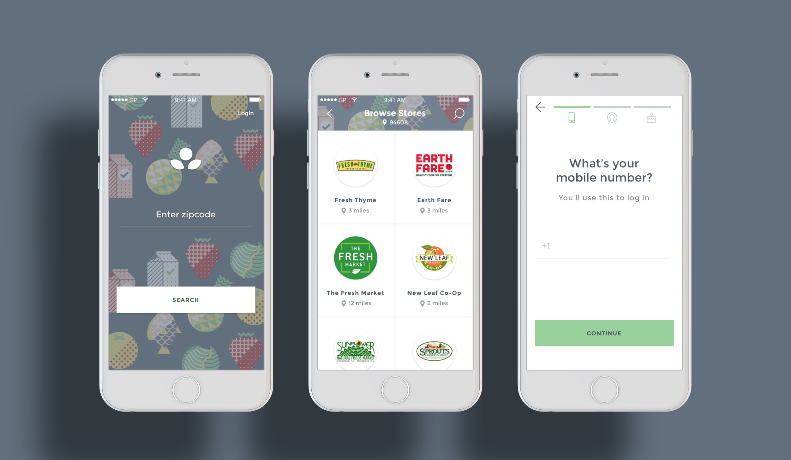
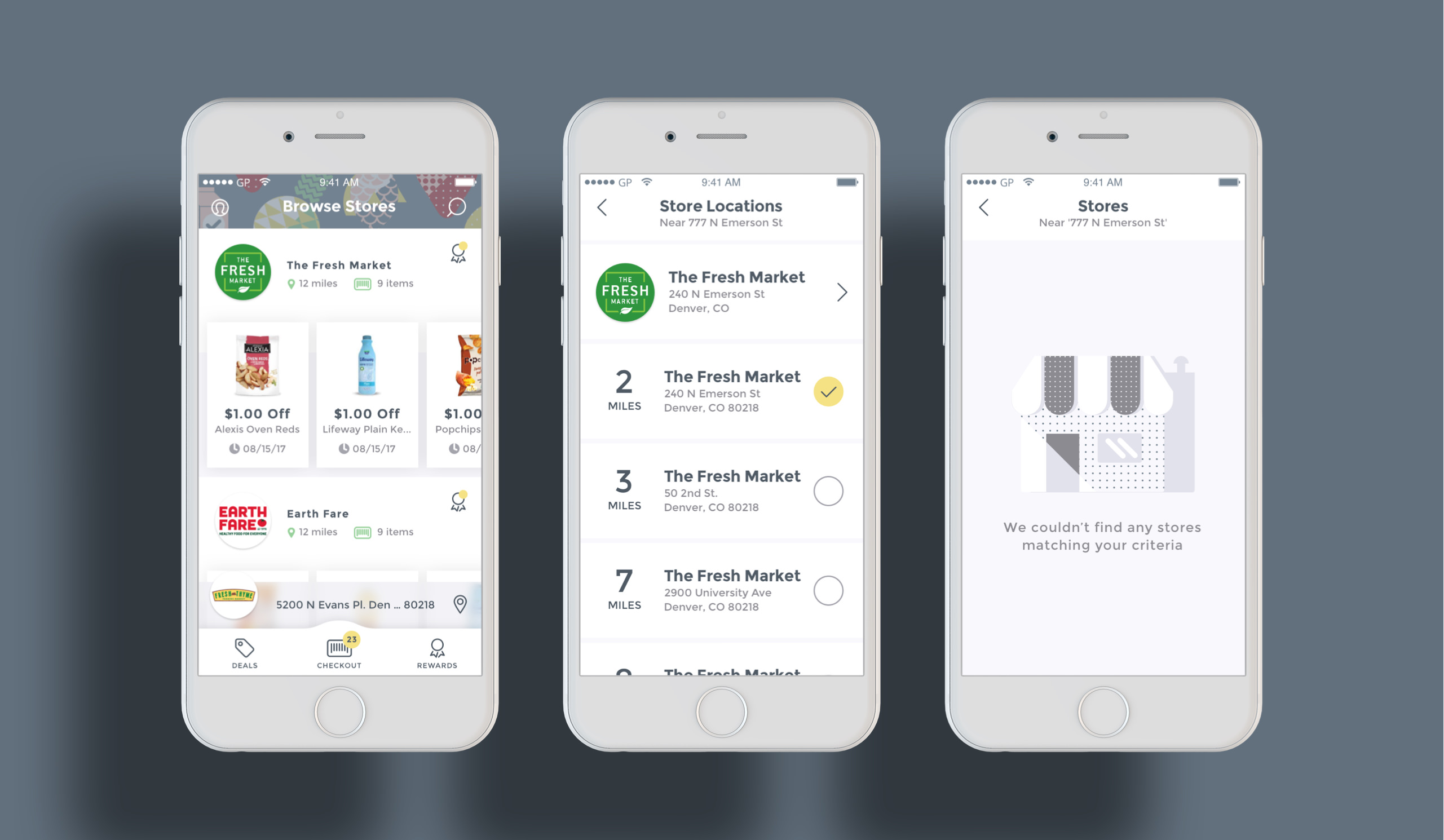
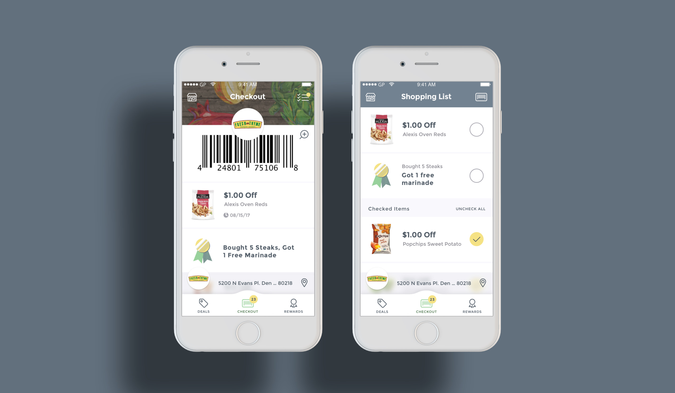
The main difference between the Thrift app and their existing GroceryPress app was that users now had the ability to search deals offered by multiple retailers filtered by proximity to the user’s GPS location or user defined zip code. The user had the ability with Thrift to add deals from multiple retailers simultaneously.
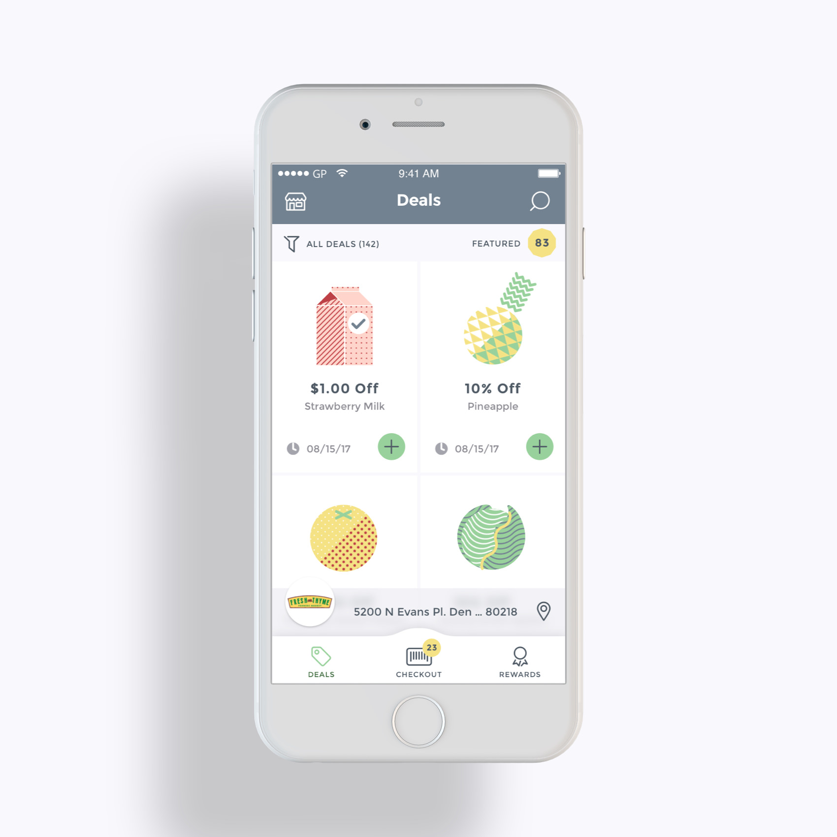
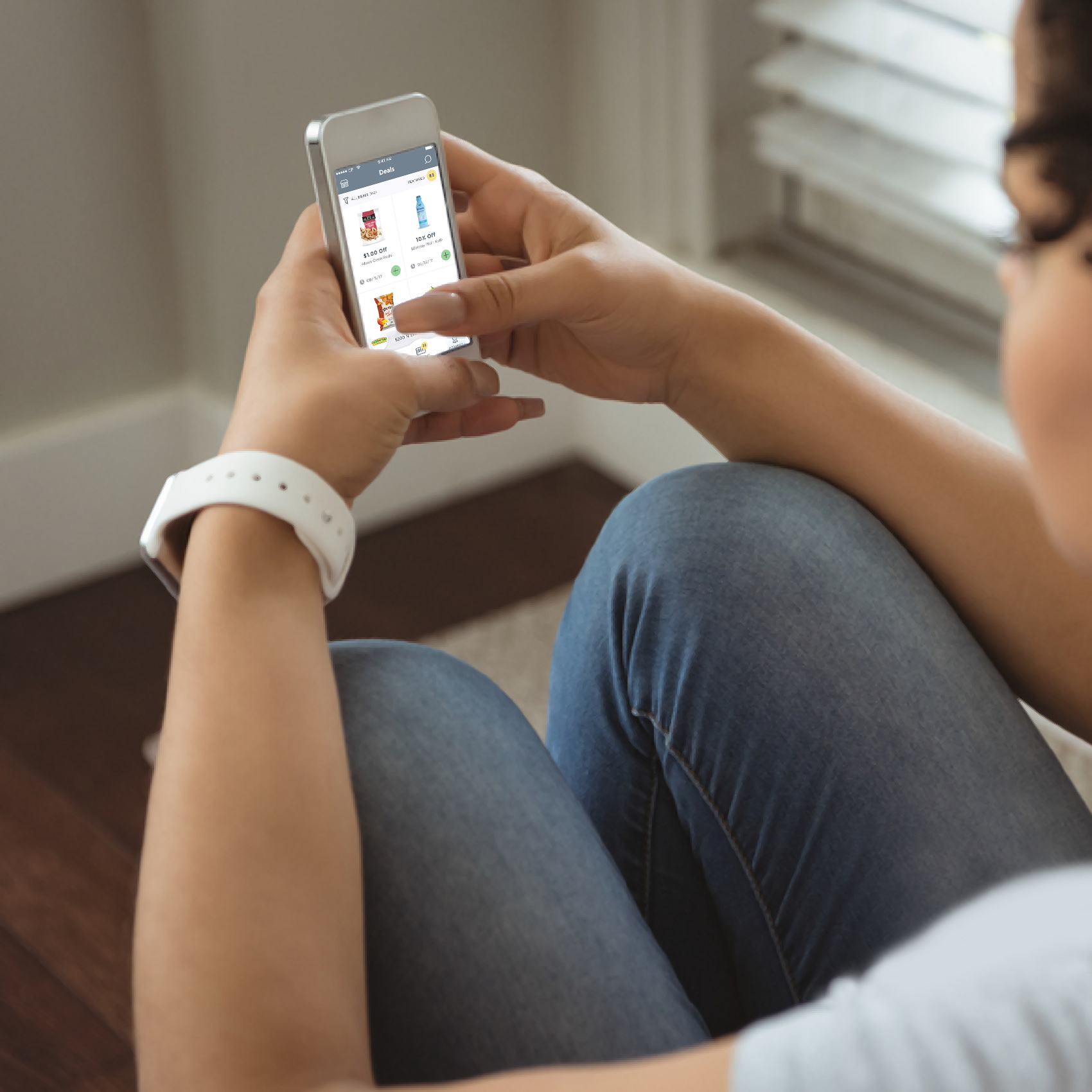
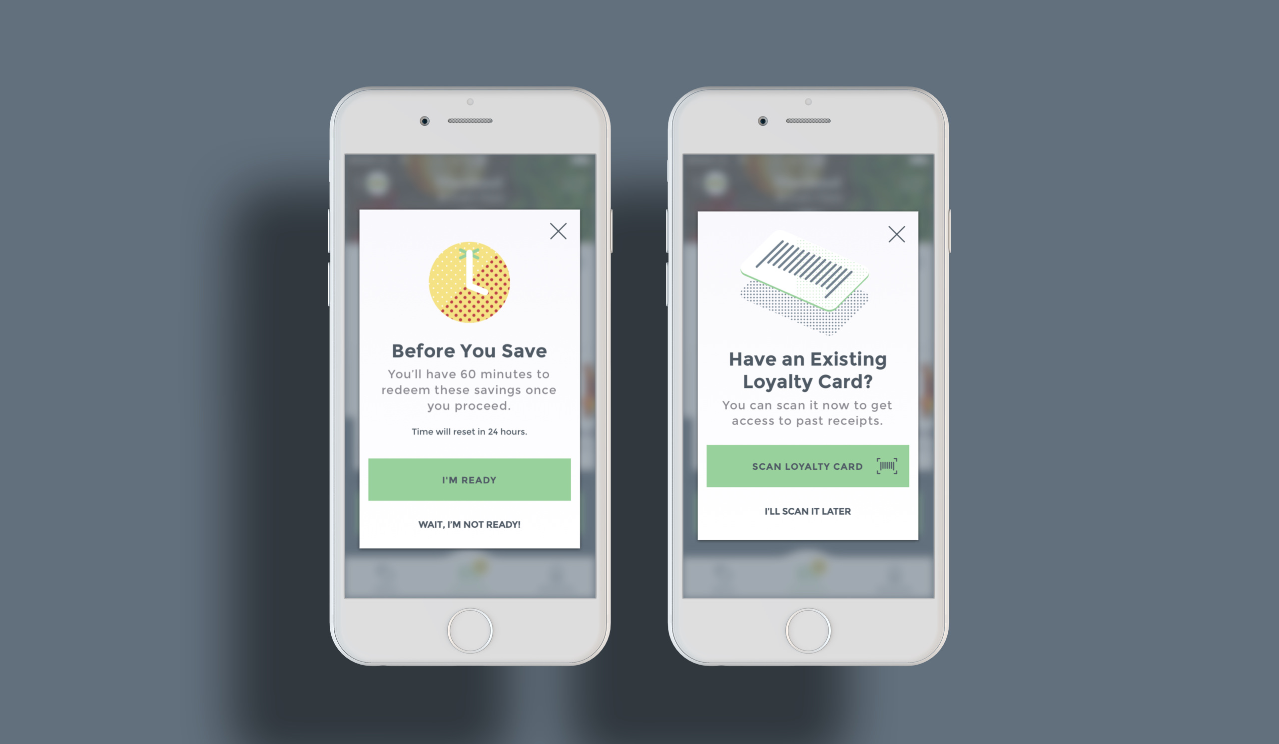
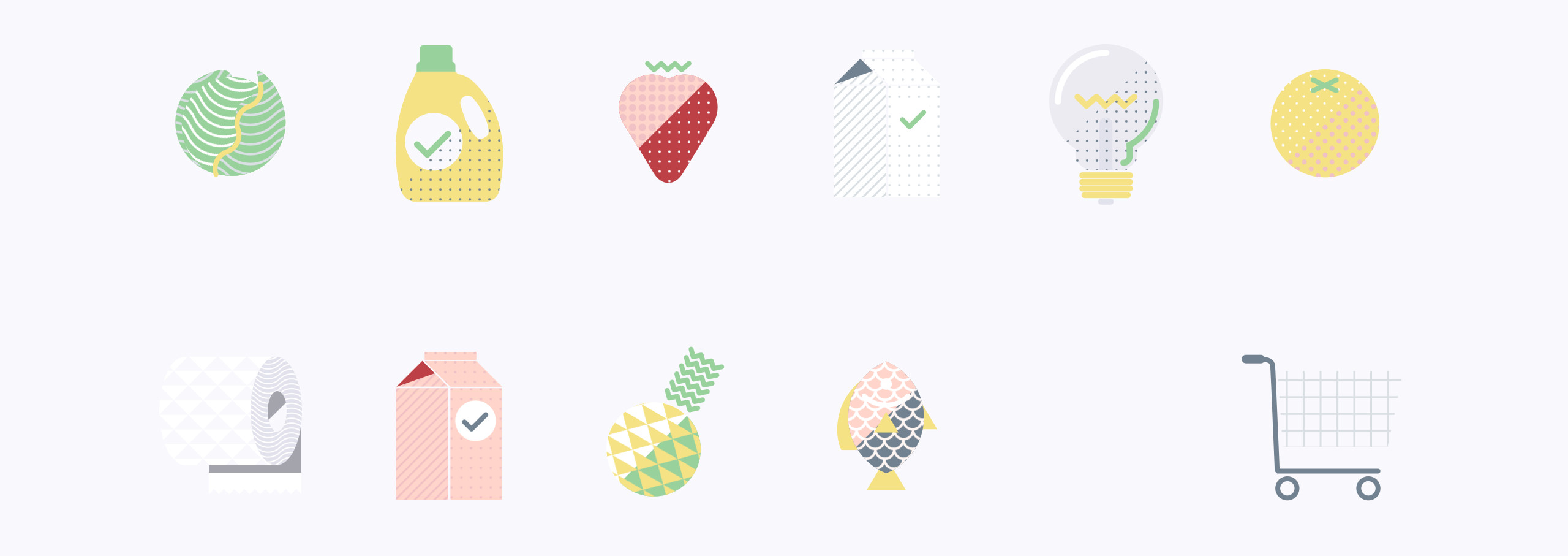
The design of the home screen contains a feed of retailer cards each with a set of featured deals that can be added directly from each card. The act of collecting coupons across multiple retailers is lightweight and is accompanied by delightful animations, making the experience easy and engaging. This clarity of content encourages a user to add and redeem more coupons. This also encourages users to try stores in their area they may not have known about or never tried before.
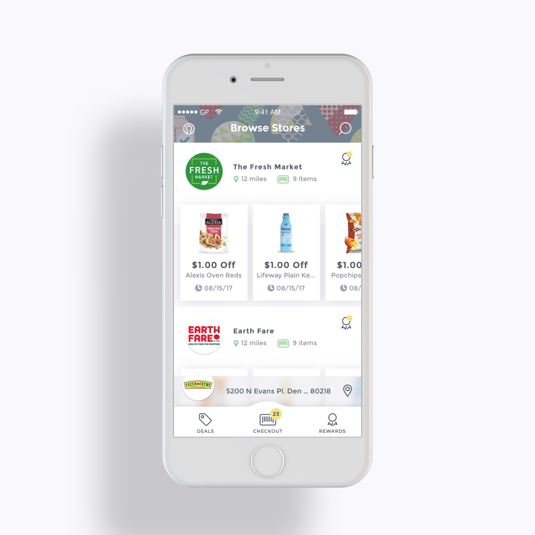
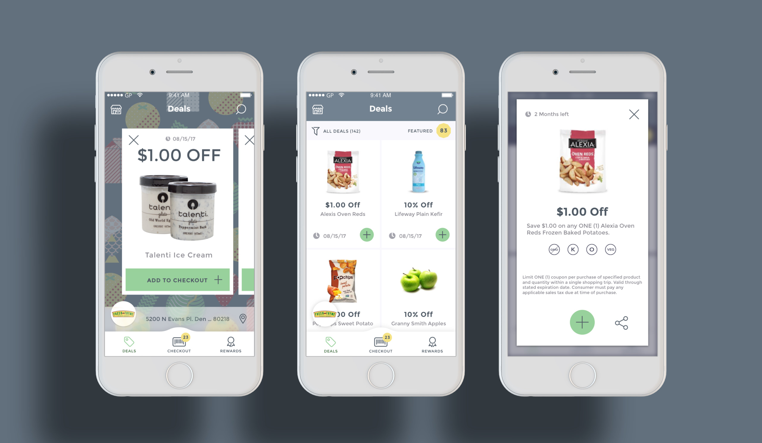
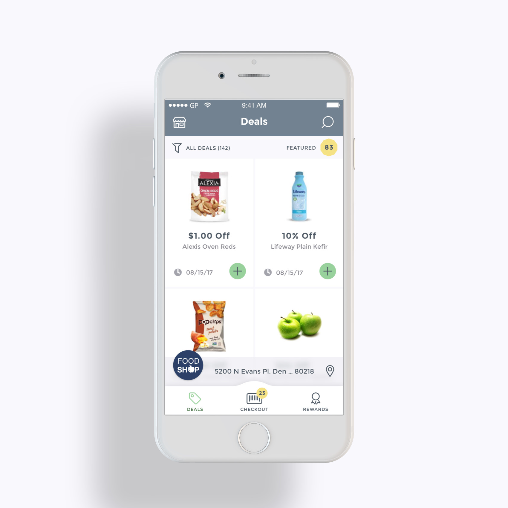
The treatment of the feed in the Thrift app was changed from a list-view to a grid-view. Using a grid of cards instead of list items in the deals feed allows for bigger images and better brand emphasis (a complaint made by retailers in the GroceryPress apps), and adds visual breathability to the design, with breathability being a key design consideration across the app This breathability insures the user isn’t overwhelmed with information, increases readability, and emphasizes information hierarchy.
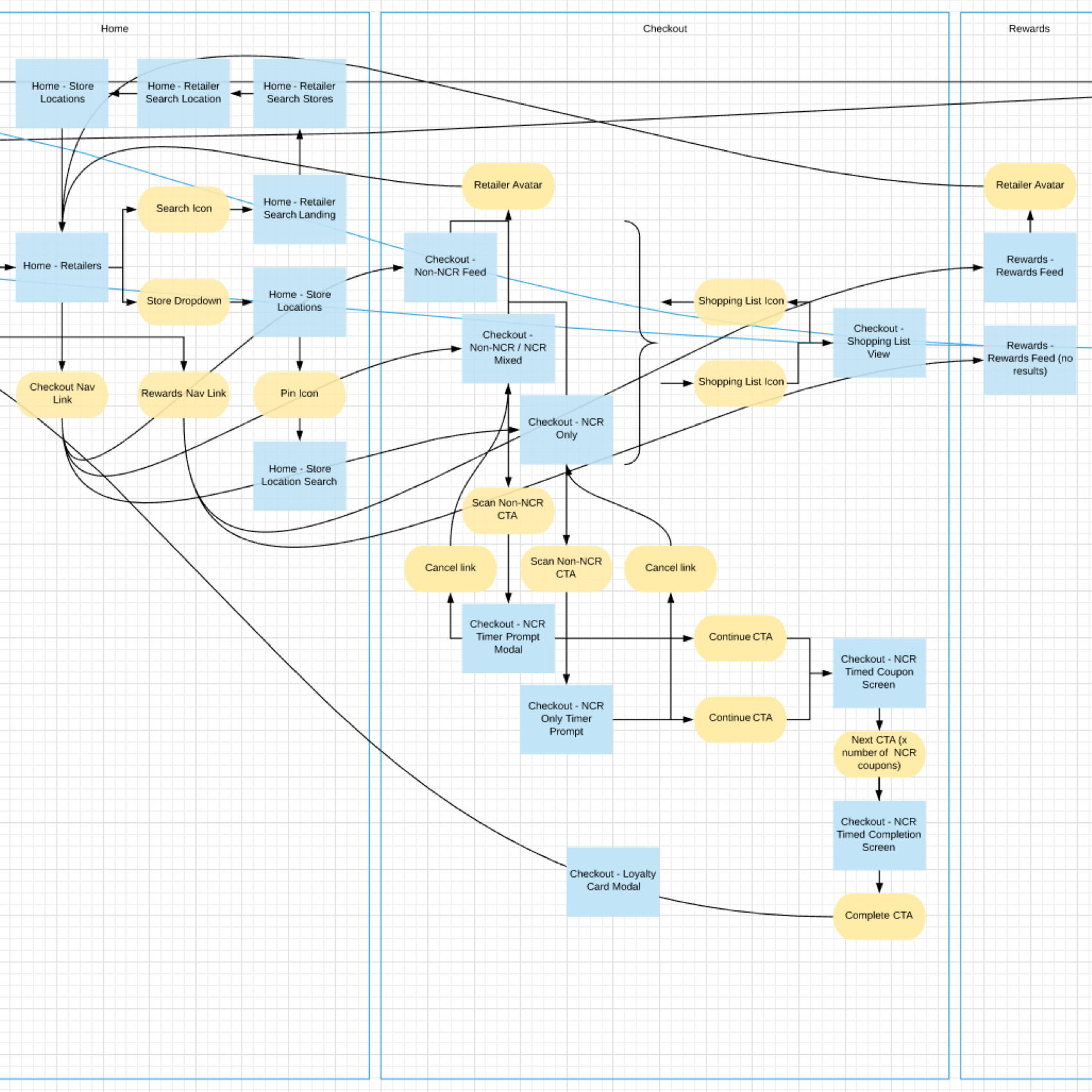
After enough screens were created to start putting them together, I created basic interaction prototypes in Invision which we were also able to import screens into directly from Sketch.
Invision prototypes gave a good high-level idea but lacked a clear map of the interaction logic between certain screens. Using Lucidchart, I created an explicit flowchart labeled one-to-one with the screens in the Invision prototype.
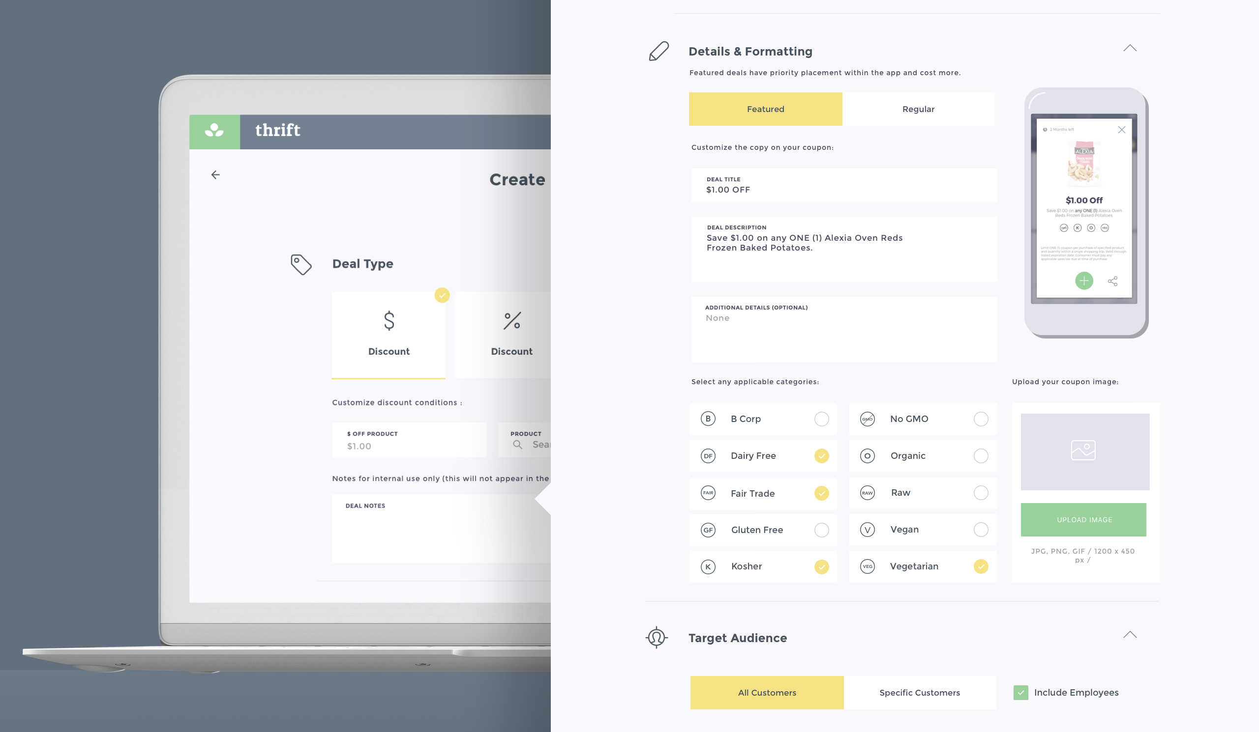
A good amount of work was done toward the Thrift rebranding of the GroceryPress retailer portal. The GP retailer portal was a web app retailers could log into to publish coupons that populated the mobile app. The portal rebrand effort had two main goals in mind, the first was unifying the visual aesthetic between Thrift and the retailer portal, the second was making much needed improvements to the user experience of the retailer portal.
I directed another designer to produce new retailer portal designs pulling from the Thrift app pattern library. I created larger illustration icons based on mobile app icons throughout the portal web app. I provided feedback around new patterns created in the portal designs to guide them along the visual language established in the brand and mobile pattern library.

For the vision of new brand we were leveraging the definition of the word ‘thrift’ pertaining to growth, longevity, and prosperity. A simple logomark was developed depicting a small sprouting plant representing new growth, consisting of two simple leaves and a flower. The flower was abstracted into a circle to double in metaphor as a coin, suggesting the savings aspect of ‘Thrift’. The typeface is a bold serif font to match the weight of the logomark, and is lowercase to evoke a softer, approachable tone appealing to the feminine bias of our brand audience.
Breathability promotes readability and improves information hierarchy throughout the interface of an app. In addition to being functional, this principle is also stylistic, adding a boldness to the overall look and feel via the use of space and size.
This boldness is a key attribute of the brand and carries through from the UI, into the logo, the illustrations and icons, and the typography. Growth, prosperity, and longevity often begin with a new, fresh, open space. This is a big part of why I designed the interface like this, to be spacious.