- Creative Director
Role
As the Creative Director for Sunrun’s Brightbox App, my role encompassed leadership, design execution, and collaboration. I spearheaded the creative vision, guiding the app’s aesthetic and functionality in alignment with Sunrun’s new branding strategy. My responsibilities included conducting market research, analyzing competitors like Tesla’s smart battery app, and integrating these insights into Brightbox’s design. Collaborating closely with the project owner, product manager, and a team of designers, I ensured the app’s user interface and experience were intuitive. I employed tools like Sketch and Cinema 4D for design, and Invision and Principle for prototyping, facilitating iterative feedback and refinement. My role also involved overcoming challenges such as organizing complex data points and enhancing user engagement beyond basic utility graphs. Despite a tight one-month deadline we successfully delivered an app that resonated well with the stakeholders and end users.
Disciplines
- UI
- UX
- Visual Design
Skills
- Infographics
- 3D Compositing
Surfaces
- Mobile
Team
- Project Owner
- Junior Designers
Project Length
- 2 Months
Deliverables
- Market Research
- Design Explorations
The Problem
Sunrun faced the challenge of developing a mobile application that not only aligned with the emerging needs of modern energy consumers but also stood out in a competitive market dominated by established players like Tesla. The primary challenge was to conceptualize and design an intuitive and engaging mobile app for Sunrun’s solar batteries – the BrightBox. This app needed to not only showcase a new brand identity, distinct from Sunrun’s existing brand but also incorporate advanced functionalities that were lacking in existing market solutions, such as Tesla’s app. The app was required to provide real-time data visualization, comprehensive energy management tools, and enhanced user engagement through features like savings tracking and weather-related information.
The Results
The Sunrun Brightbox App achieved notable success in its beta launch. Users responded very well to its intuitive design and functionality, particularly highlighting the ease of navigation and the clarity of the real-time energy data visualizations. The app effectively met Sunrun’s business objectives by establishing a distinct brand identity and differentiating itself in the competitive home energy management market. The innovative features, such as one-handed navigation and the inclusion of a savings view, were well-received, enhancing user experience and engagement. This initial success in the beta phase provided valuable insights for future development, with stakeholders expressing high satisfaction, indicating the app’s potential to make market impact upon full release.
The home energy management sector is witnessing a significant shift with the increasing adoption of solar energy and smart home technologies. Consumers are actively seeking solutions that offer greater control over their energy usage, real-time data, and insights into cost savings. In this context, Sunrun’s initiative to develop the BrightBox app was not just a technological undertaking but a strategic move to position itself as a frontrunner in this dynamic market. The project involved market analysis of existing solutions like Tesla’s smart battery mobile app and Panasonic Smart Cities app and fully rebranded UI/UX design.
The goal was to create a usable, informative, and visually appealing mobile application that would enable users to monitor and manage their home energy with ease while also providing a novel and engaging user experience. The challenge was compounded by the need to establish a new visual identity for the product, distinct from Sunrun’s current branding, and to incorporate a comprehensive range of functionalities within a highly constrained timeline.
The product manager wanted to design along the same lines aesthetically as the Panasonic Smart Cities app, and also reference Tesla’s smart battery mobile app. Similar infographic styles were carried over from the Panasonic app into BrightBox. The Tesla app was analysed to get a sense of what was working and what could be improved upon in the BrightBox app.
The Tesla app was a bit spare in places where additional information would have been useful. The biggest chunk that seemed to be missing at the time, was information about money saved. It seemed better indications of current weather conditions and time of day could emphasize a better at-a-glance context in the BrightBox app (which didn’t exist in the Tesla app).
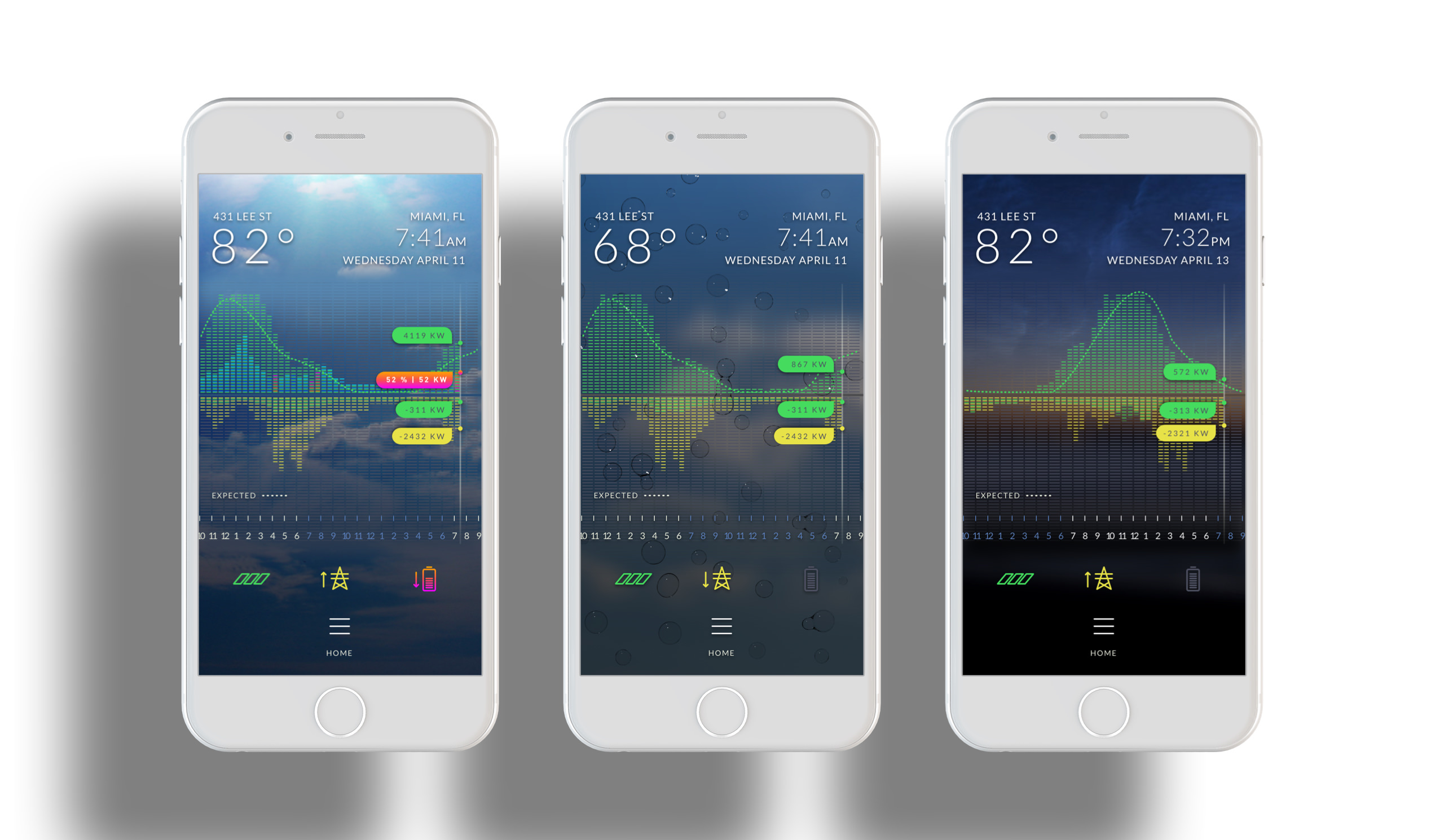
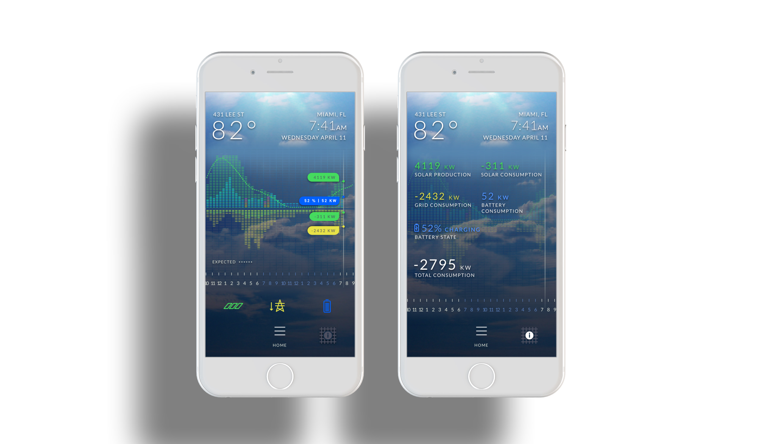
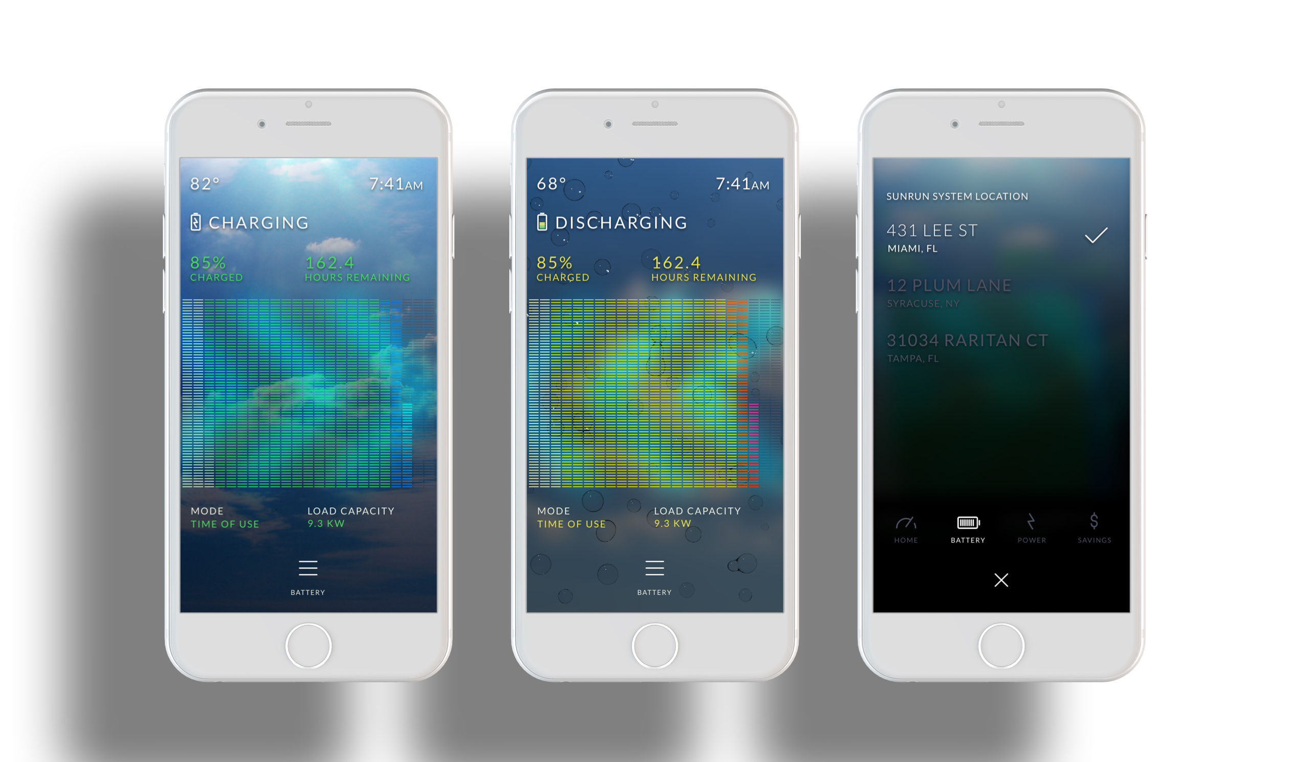
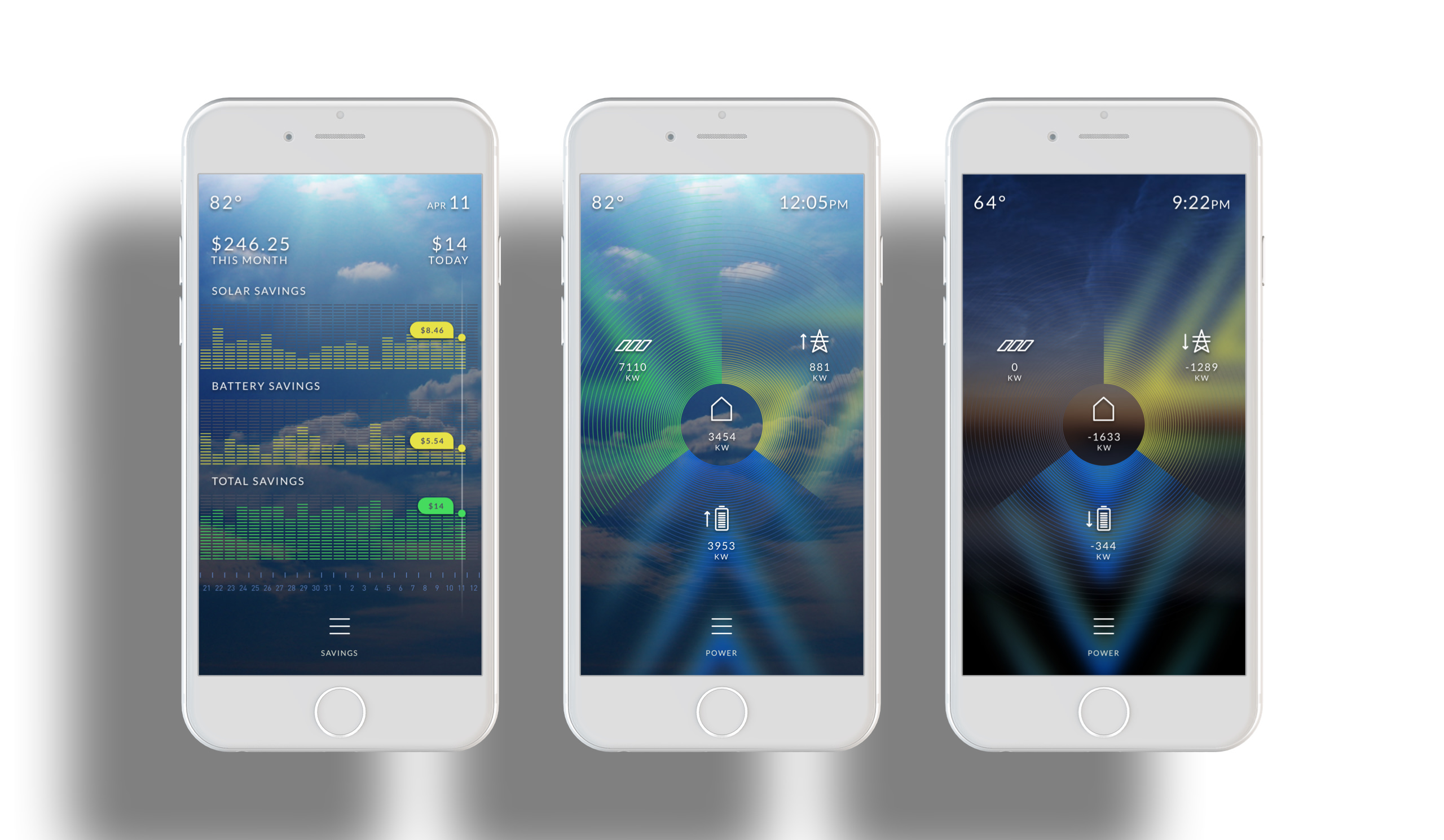
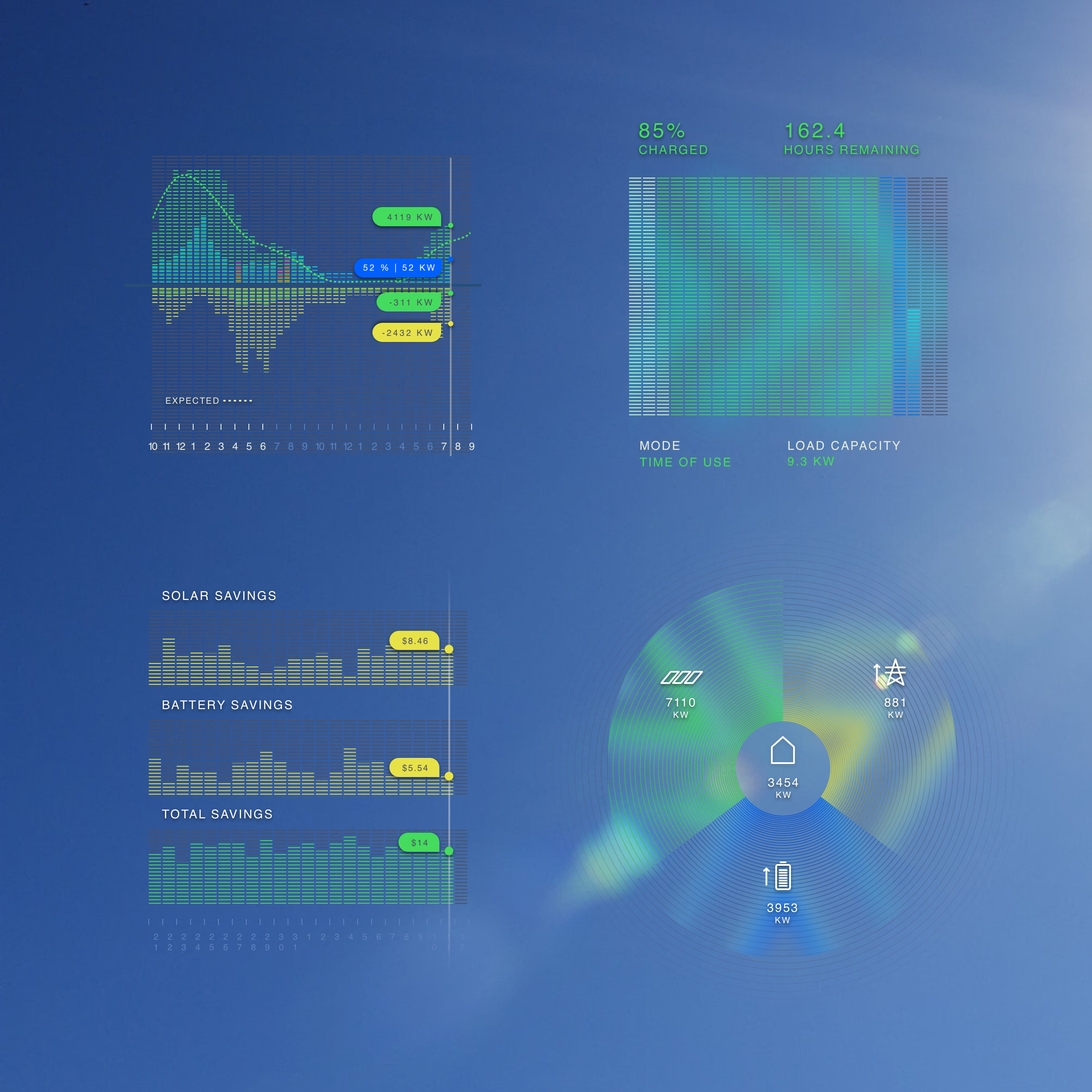
After meeting with the product lead to share the research done on the Tesla app, he provided a list of data points he wanted represented and organized within the app. He wanted to show: solar cycle, weather, and location, with correlation to production expectation; real-time graphs showing consumption, battery charge or discharge, and production; and an ability to toggle view based on time, and chronological zoom; battery charge, state (charging from solar, or discharging), load capacity, mode (time of use, backup, or consumption), and battery reserve level (for backup). These points were implemented with an added a view for savings, and power distribution.
The project had a one month turn around. I created a couple different initial designs exploring visual treatments and UX scenarios. I designed the interface and graphs with Sketch, and used Cinema 4D to create full screen weather backgrounds. The UX process was integrated into the UI explorations. I used Invision to create basic prototypes, and Principle to demo animations in the app.
The product lead and the stakeholders were impressed with the work. It was a challenge to organize the data points without an existing framework to reference. It was also a challenge to think of ways to make the app valuable to a user beyond utility graphs. Adding a layer representing money saved made the app’s array of graphs more relatable for the user, incentivizing use and adding value.
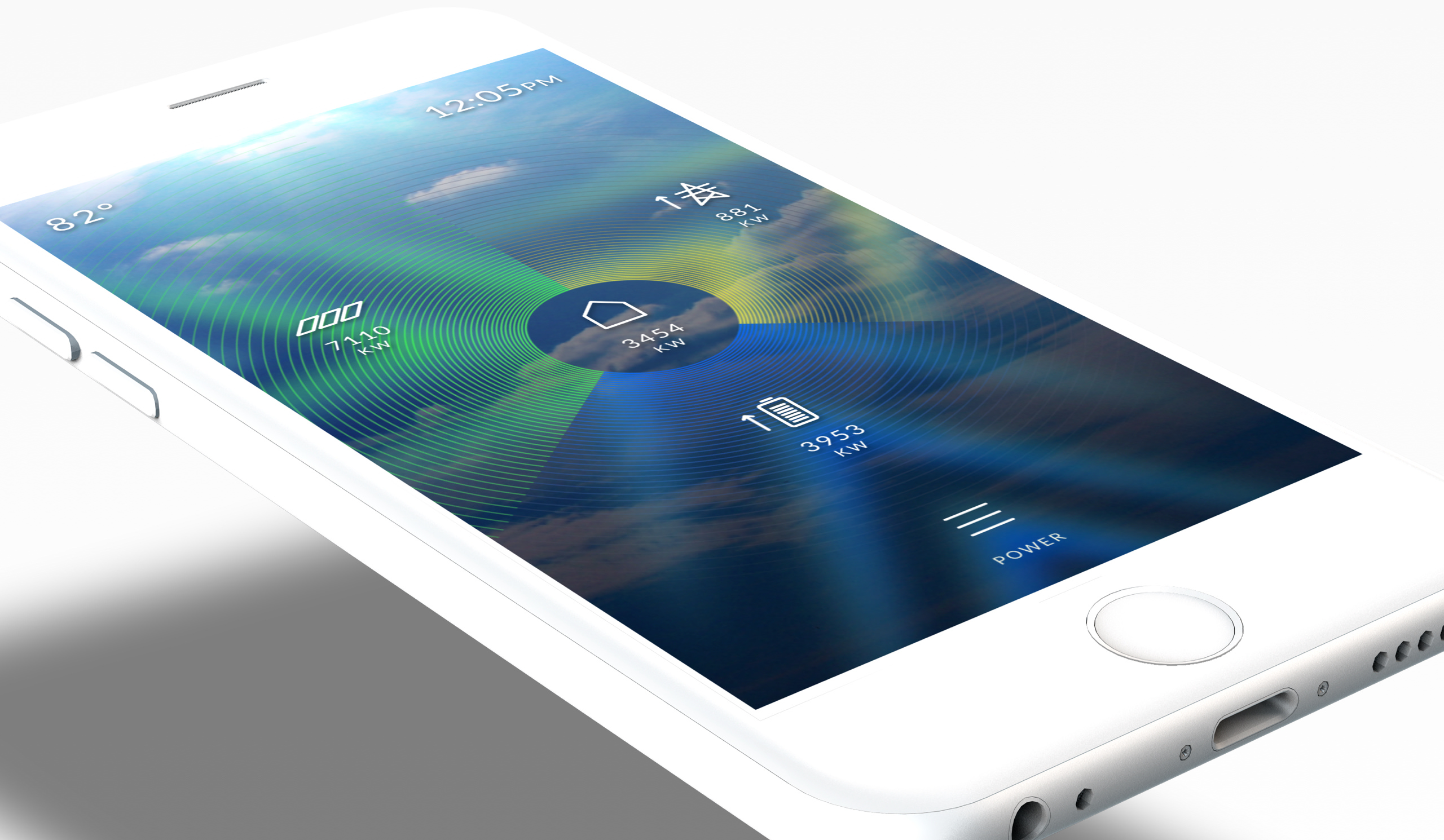
The BrightBox app designs employ a full-screen background that changes in relation to time and weather. App navigation is concentrated at the lower part of the screen with one handed app use in mind. I made
this consideration because the user is generally viewing the app at-a- glance. On the home screen, colored data layers can be toggled on and
off via color-corresponding icons pertaining to solar energy gained and expended, grid energy expended or recycled, and battery charge. A battery screen shows an articulated charge bar which indicates charge or discharge and the current overall charge in the battery. A savings screen charts out per-day savings pertaining to solar, battery, and total savings. A power screen gives a visual indication of where power is being collected, recycled, or expended for solar, grid, and battery.