
- Visual Product Design Lead
Role
As the Design Lead at Instrument for the Salesforce+ Streaming Video Platform, my primary objective was the complete overhaul and optimization of the design system using Figma’s latest features. I led a team of senior and junior designers, collaborating to align design with the product’s strategic vision and user experience goals. I collaborated closely with cross-functional teams, including the Creative Director and UX Lead, to ensure design decisions were both technically feasible and aligned with business objectives.
Disciplines
- UI
- Design Systems
- Visual Design
Surfaces
- Desktop
- Mobile
Team
- Creative Director
- UX Lead
- Lead Strategist
- Executive Producer
- Senior Designer
- Junior Designer
Project Length
- 14 Months
Deliverables
- Design Explorations
- Design System
- Guidelines
The Problem
The Salesforce+ streaming video platform, serving as the virtual experience for Salesforce’s Dreamforce events, faced challenges in its design system. The system required a comprehensive overhaul to restore component functionality, make user experience improvements, and reinstate system scalability. The existing design system was dysfunctional, leading to inconsistent designs, inefficient processes, and challenges in implementing new features.
The Results
The overhaul of the Salesforce+ product system significantly enhanced both internal efficiency and the user experience of the product. The introduction of Figma variables reduced breakpoint design time by over 80%. The optimization eliminated design inconsistencies and restored scalability. Overall, the project drastically improved design workflow and product usability, receiving positive feedback from both the internal team and platform users.
Salesforce+ is a dynamic platform with a diverse range of content and features, catering to a global audience. The platform’s design system was not keeping pace with its rapid growth and the evolving needs of its users. Designers and developers faced difficulties with an outdated library that often led to broken designs and reluctance to utilize the system. The introduction of new features such as video tagging, player settings, and event filtering further compounded the complexity. The task at hand was not only to repair and optimize the existing system but also to future-proof the design process, ensuring scalability and adaptability to new requirements.
In my role for Salesforce+, the primary objectives were to rebuild and optimize the design system library, enhance usability, ensure brand consistency, and streamline the design process for efficiency and scalability. This involved a meticulous approach to redefining design elements, from grid systems and color palettes to component structures and iconography, all while maintaining alignment with Salesforce’s brand guidelines and business goals.
Grid optimization with variables
With the introduction of variables in Figma, I saw an opportunity to simplify the process of creating breakpoints for all screen designs. Prior to creating variables for grid columns, designing for various breakpoints could sometimes take designers a couple of days.
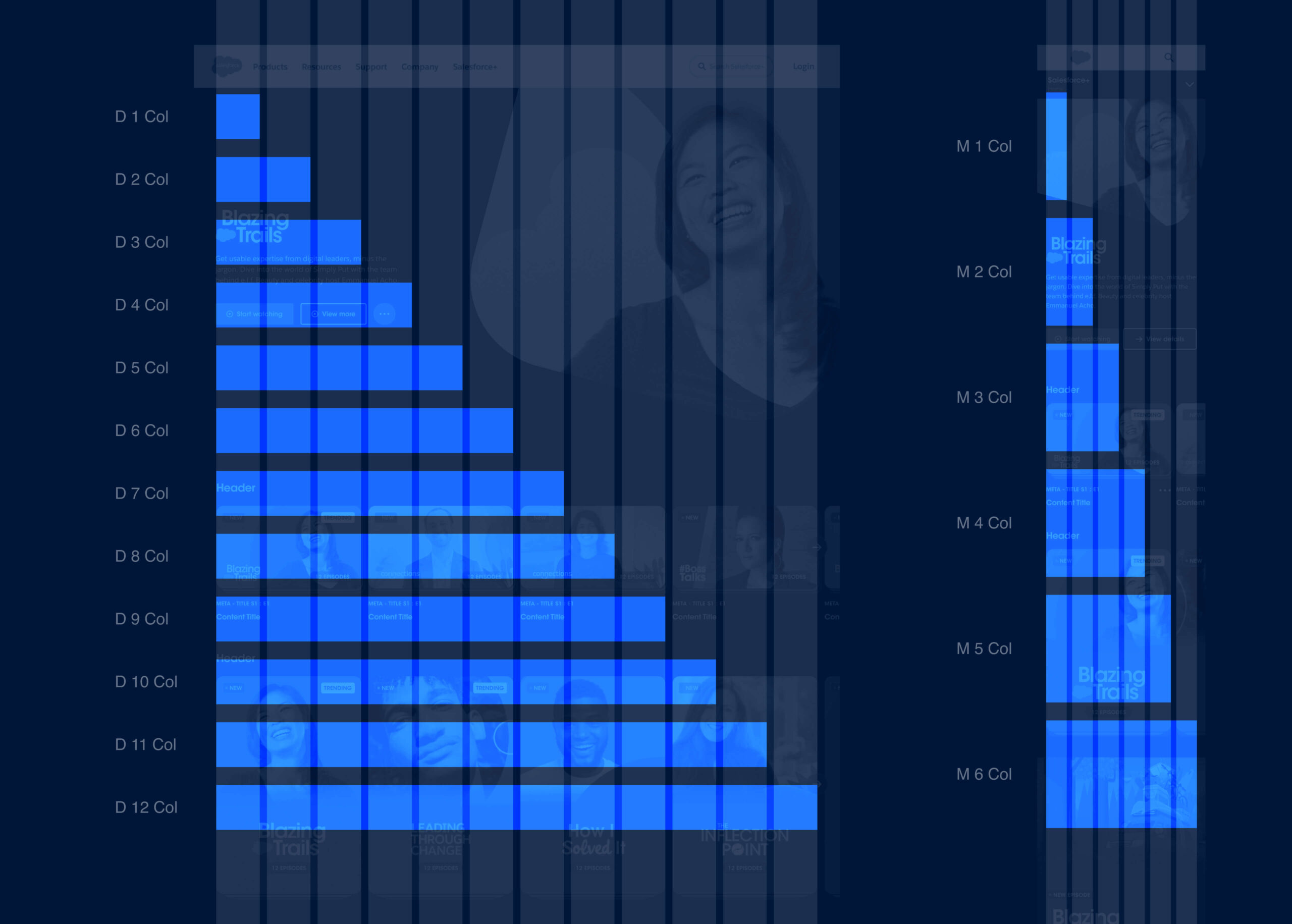
In the variable database, I captured the screen width, margins, gutter, and the width of each column span per breakpoint. This allowed designers to assign column span variables to the width of any design element or component within a design.
With variables plugged into the components on a page, all designers had to do when a certain breakpoint was needed was to duplicate the design and then select the breakpoint from the variable dropdown in Figma. This optimization reduced hours of work to just minutes.
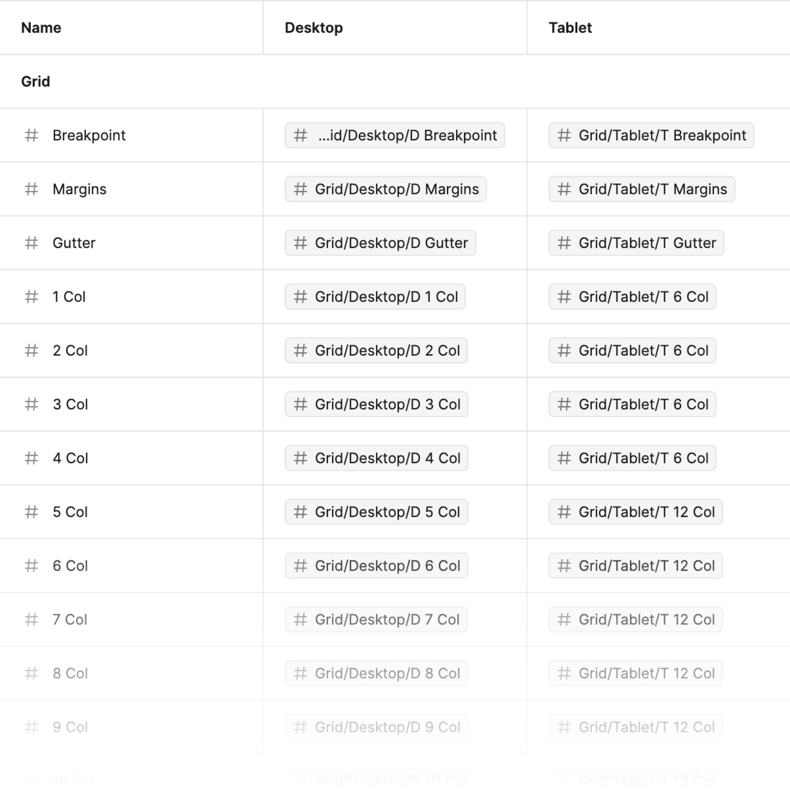
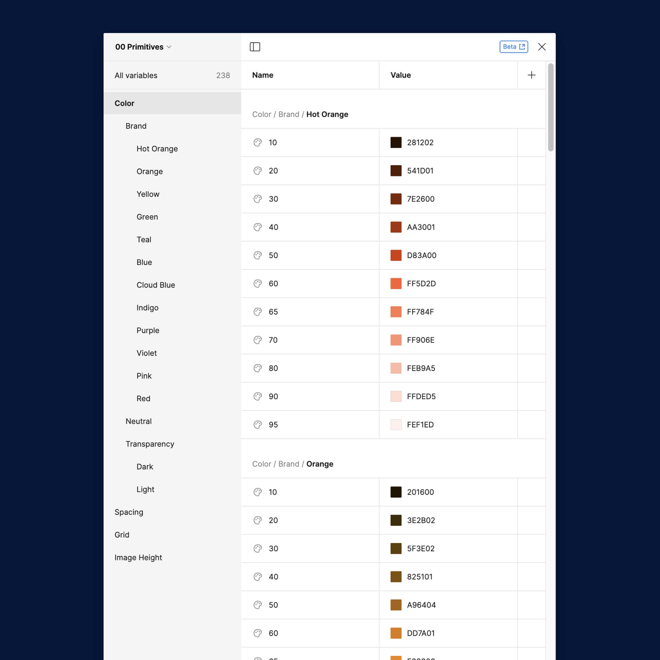
Pictured at left is the variable database for grids, specifically the breakpoint tokens. Primitive variables are assigned to breakpoint modes to facilitate changes to an entire design with just a dropdown option. This optimization also provided the development team at Salesforce with detailed grid and breakpoint information, increasing efficiency and parity between design and implementation.
Before creating grid variables, I consulted with the development department to determine the specifications they typically needed for breakpoints and the grid.
Color optimization with variables
The color palette for Salesforce+ is two-dimensional, with one axis being hue and the other being tone. As a designer, assigning the right color to the right element presented potential guesswork. With variables, I saw an opportunity to reduce the complexity of our current color styles and make them easier to parse and select.
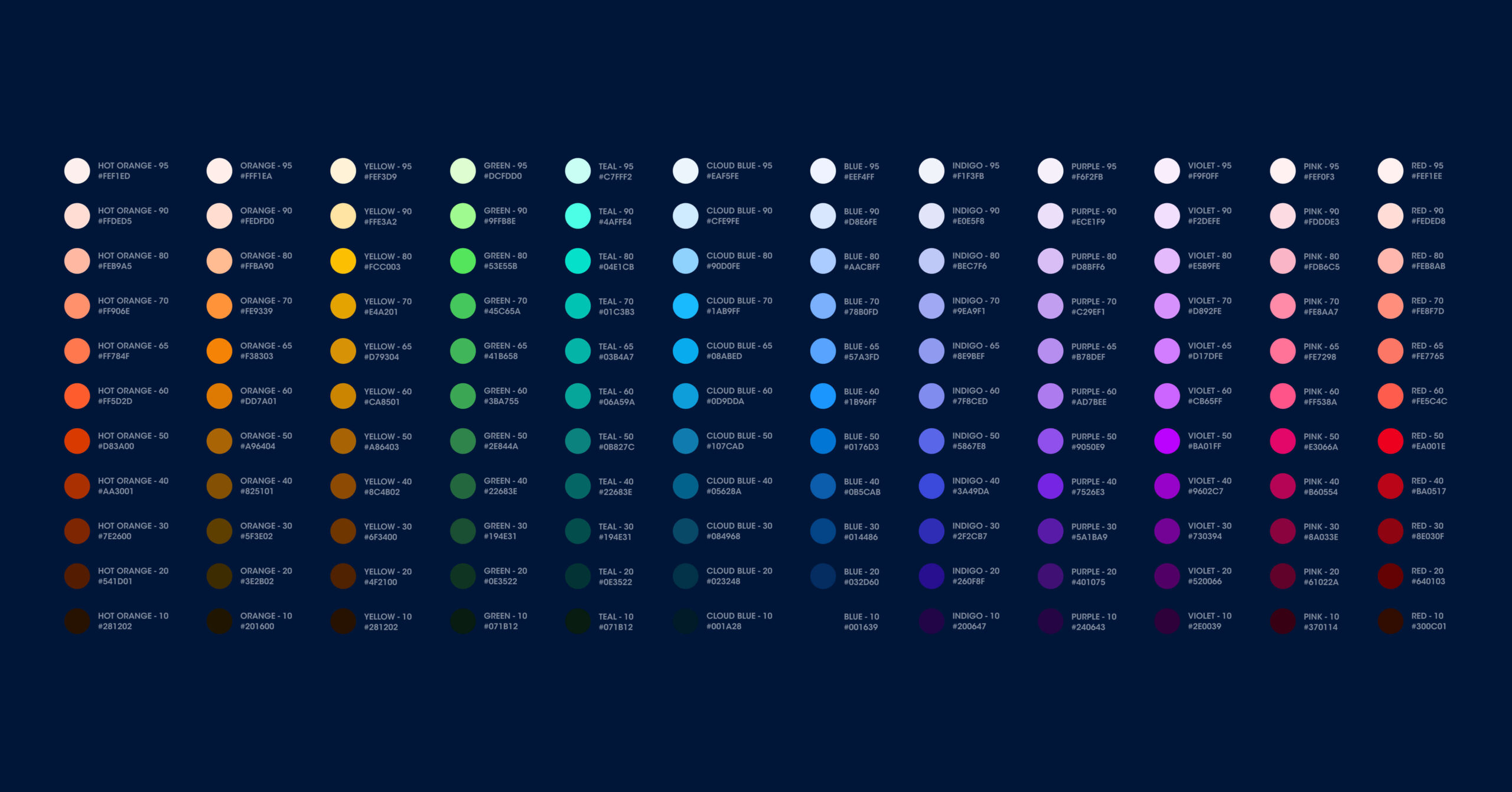
I discovered that for components designers were selecting colors for, only one tone for each hue was being used. This allowed me to tokenize the colors, removing the guesswork of which tone was the right choice per hue.
I worked with the Creative Director to ensure the tokenization was within existing brand guidelines, and to help me fill in the gaps where specifications were missing.
The Salesforce+ product was mostly dark-themed but occasionally had inverted UI surfaces like modals or copy-dense pages such as the terms of service page. I tokenized a light and dark theme to make it easier for designers to change the colors of the UI depending on the theme context.
Pictured at left is the variable database for colors, specifically UI tokens. Primitive variables are assigned to theme modes to facilitate the change of design element color themes via a dropdown. This optimization also provided the development team at Salesforce with detailed color specifications.
Documentation
By optimizing the grid and colors using variables, we were also able to optimize the documentation. This allowed us to focus on representing component states, their logic, and usage guidelines for the development teams.
I worked closely with the creative director to refine state designs, spot-check the component designs with all states exploded against brand guidelines and product vision, and ensure guidelines followed the existing structure and process at Instrument. I also worked closely with the junior designer on the team, delegating guideline production work and providing feedback.
Before Figma’s new variant properties
The component that bore the brunt of the feature requests was the card component. As a result, it was the most broken of all the components. Pictured below, you can see the card component before Figma introduced variant properties.
Some features that we had to design included the ability to hide a show logo depending on the product context, indicating whether a video was live or not, indicating if a video was coming soon, or if it was trending, or if a user had already watched it, etc. As you can see below, managing the variant population was becoming challenging.
After Figma’s new variant properties
Most of the features in the card component were elements that required visibility toggling. With the boolean property, the need for unique variants per toggle permutation was eliminated. This not only resulted in significantly fewer variants, but also allowed us to combine the different card components into one. There were cards for individual videos, events, series, and full-width feature cards. We could also combine the mobile variants. This made managing the card component significantly easier.
The instance property allowed us to organize logos and thumbnails into element galleries that are now easy to access as variant drop-downs. Text properties allowed us to surface nested text fields, making everything editable from the right column.
Pictured at left is a demo of the many different variant properties that can be adjusted for the optimized card component. These include breakpoint, logo visibility, tag visibility, collection visibility, copy visibility, etc. Pictured below is a demo of the ability to change the card type.
The System
I took every opportunity to combine duplicative components and remove superfluous ones. My goal was to create a fully optimized, easy-to-maintain, lean, and deeply branded system.
The system was structured using the atomic design methodology. Styles were organized at the 00 level, components at the 01 level, and elements at the 02 level. Library items were named with this numeric prefix for high-level organization.
Styles from the existing library were translated into primitive variables that could be tokenized (pictured on the left). I also cleaned up and documented the type ramp for development teams.
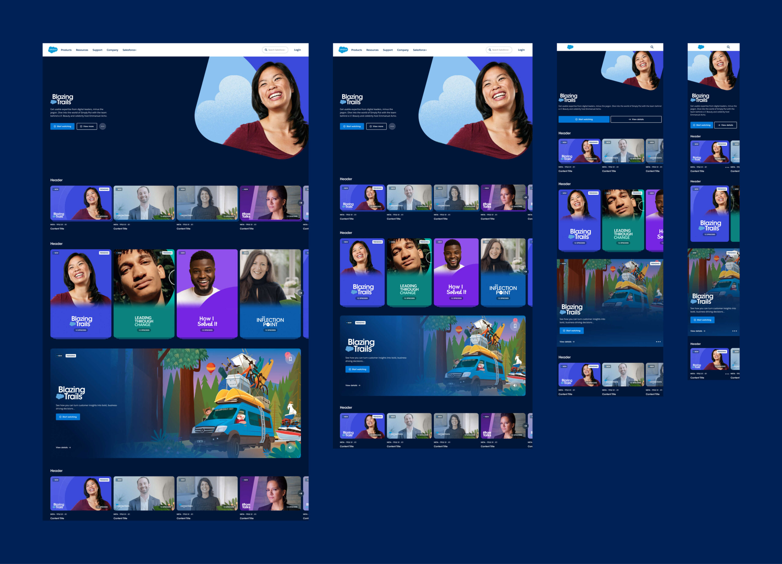
The Salesforce+ streaming video product was robust, with a wide array of content objects (pictured below). These objects needed to be designed in a way that could anticipate new features. It was essential for me to identify the core patterns in the content and formalize them at the system’s foundation.
Elements
Much of the library’s scalability is due to the lean nature of the system’s foundation, the elements, the pieces that make up the larger components. Things like copy blocks, navigation, buttons, and avatar lockups, all consist of a common nested element across all the top-level components.
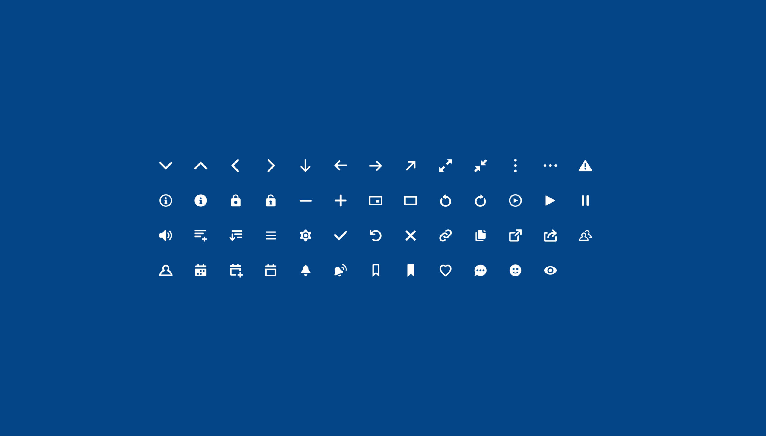
I scoured the existing design materials for show logos, thumbnails, avatar photos, illustrations, and graphics to optimize and create centralized galleries for easy instantiation. I did a fair amount of iconography work, creating missing icons using the existing style.
Updating the library non-destructively
To empower the team to continue updating the library, I created a workflow for archiving old components. Essentially, when an existing component needs an update, you duplicate it, move the original to an ‘Archive’ page, and rename it with the date appended. The copy on the component’s page can then be updated and published with changes, and it will appear in the expected asset tree. The archived component still exists and therefore won’t break designs using it when the library updates are accepted. Designs can then be manually updated where desired with the new component, non-destructively.
The design team I worked with at Instrument was extremely talented and intelligent. I worked diligently alongside them, exploring new features and providing feedback on designing for a system, as Figma’s component workflow was relatively new to them.
I worked closely with the UX lead throughout both rounds of optimization and building to uncover usability opportunities, vet design decisions, and component states. I collaborated closely with the lead strategist on new features to create scalable solutions. This project was challenging and dynamic. I’m extremely proud of the team I worked with to create such a simple system for such a complex product.
Process
Round 1 onboarding & research
The client needed us to change the video cards to be able to toggle series logo visibility, add additional states to the status tag, and have a visual affordance to represent if a video was live. They needed us to add language settings to the video player. They also needed UX improvements around filtering and navigating the event schedule for logged-in users. Taking a look at the existing product and Figma library, I saw opportunities to expedite this work and improve the library from a functionality and workflow perspective.
Round 1 exploration & execution
With a rough project roadmap in place, I delegated some explorations to the senior designer and began work on system optimizations.
Round 1 implementation & documentation
Familiarized myself with the dev team and their process around system implementation. Began onboarding the wider organization to system improvements to facilitate stress testing. Initialized new system guidelines.
Round 2 onboarding & research
The client had a multi-faceted tagging system they wanted to add to all card types across the product which challenged the current system structure. Figma also had just added variant properties which presented the perfect excuse for us to apply a second round of optimization to the system library.
Round 2 exploration & execution
I defined explorations with the creative director and delegated some explorations to the junior designer, beginning work on the second round of system optimizations.
Round 2 implementation & documentation
Completed the system guidelines. Fully optimized the library with Figma’s new variant properties and variables.