- Art Director
Role
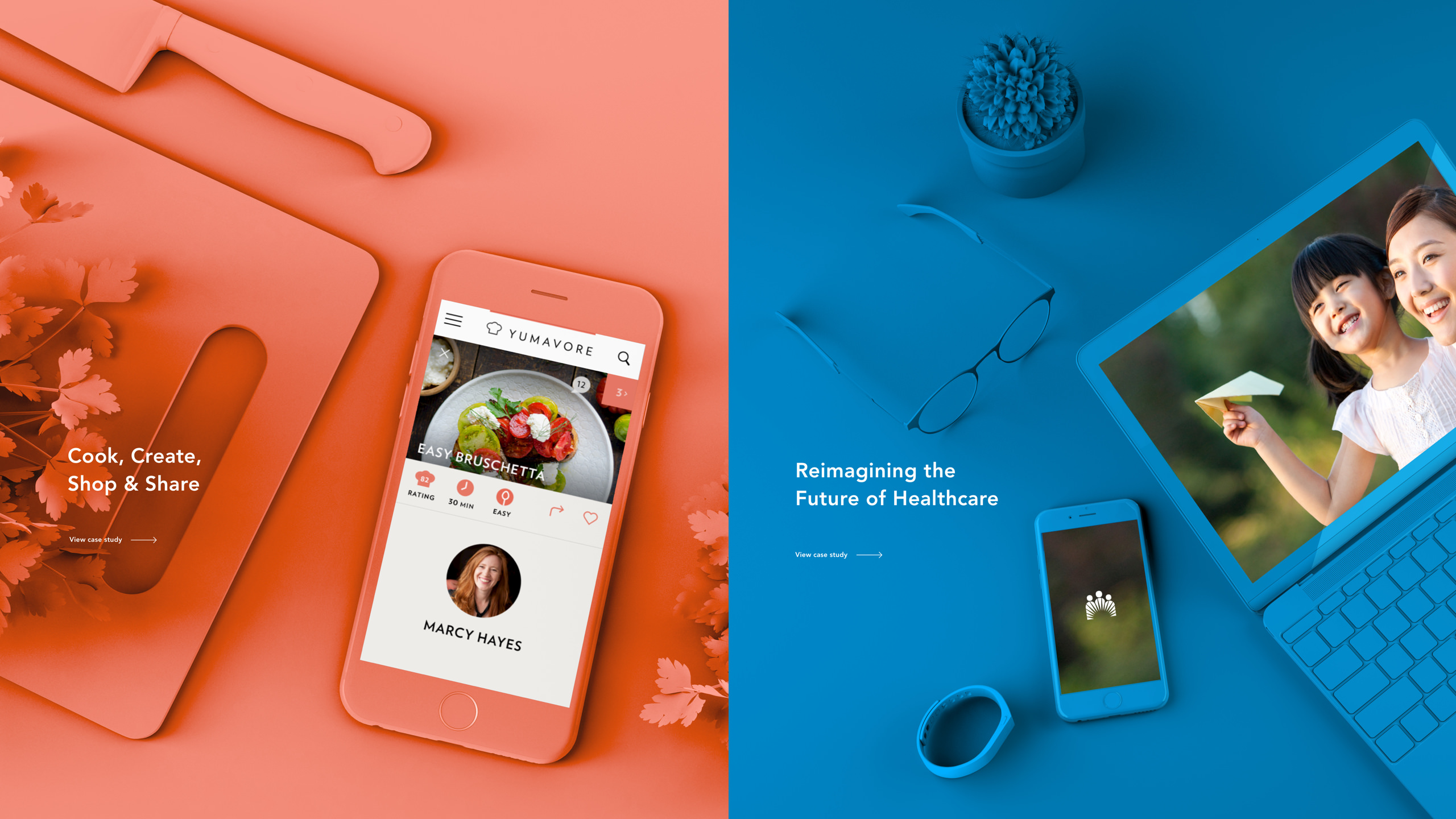
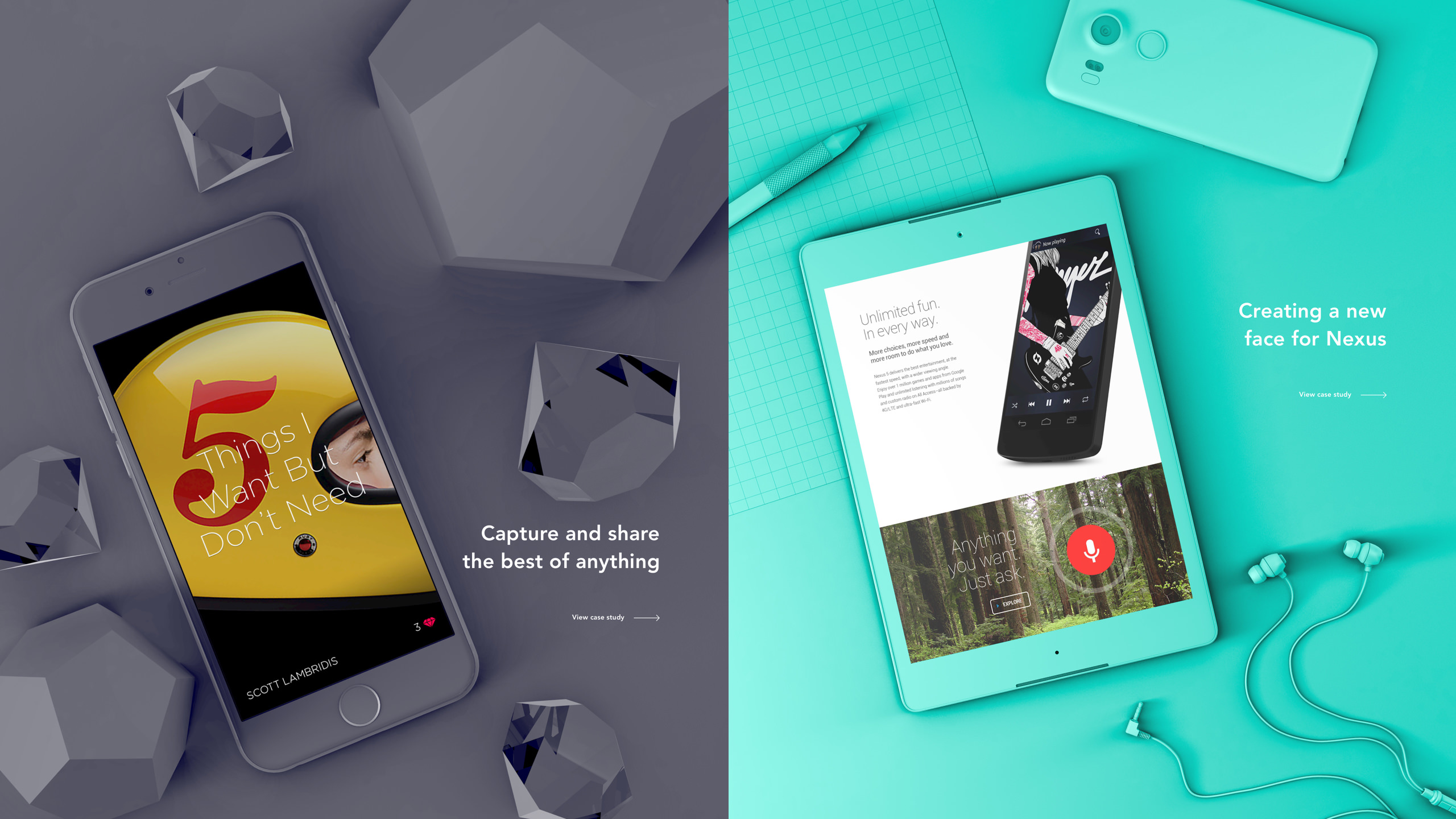
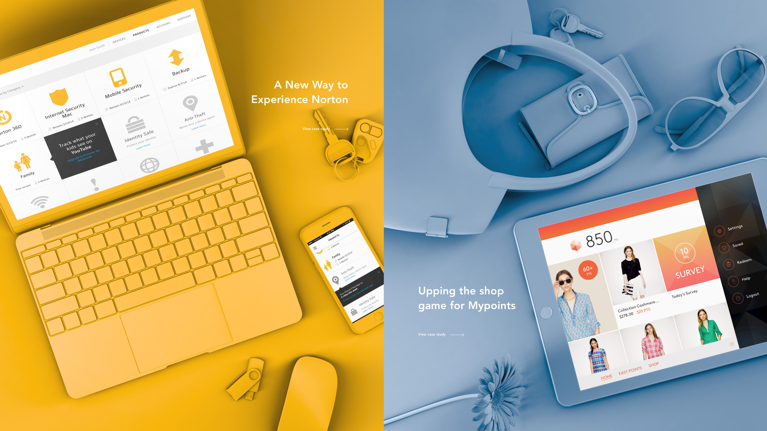
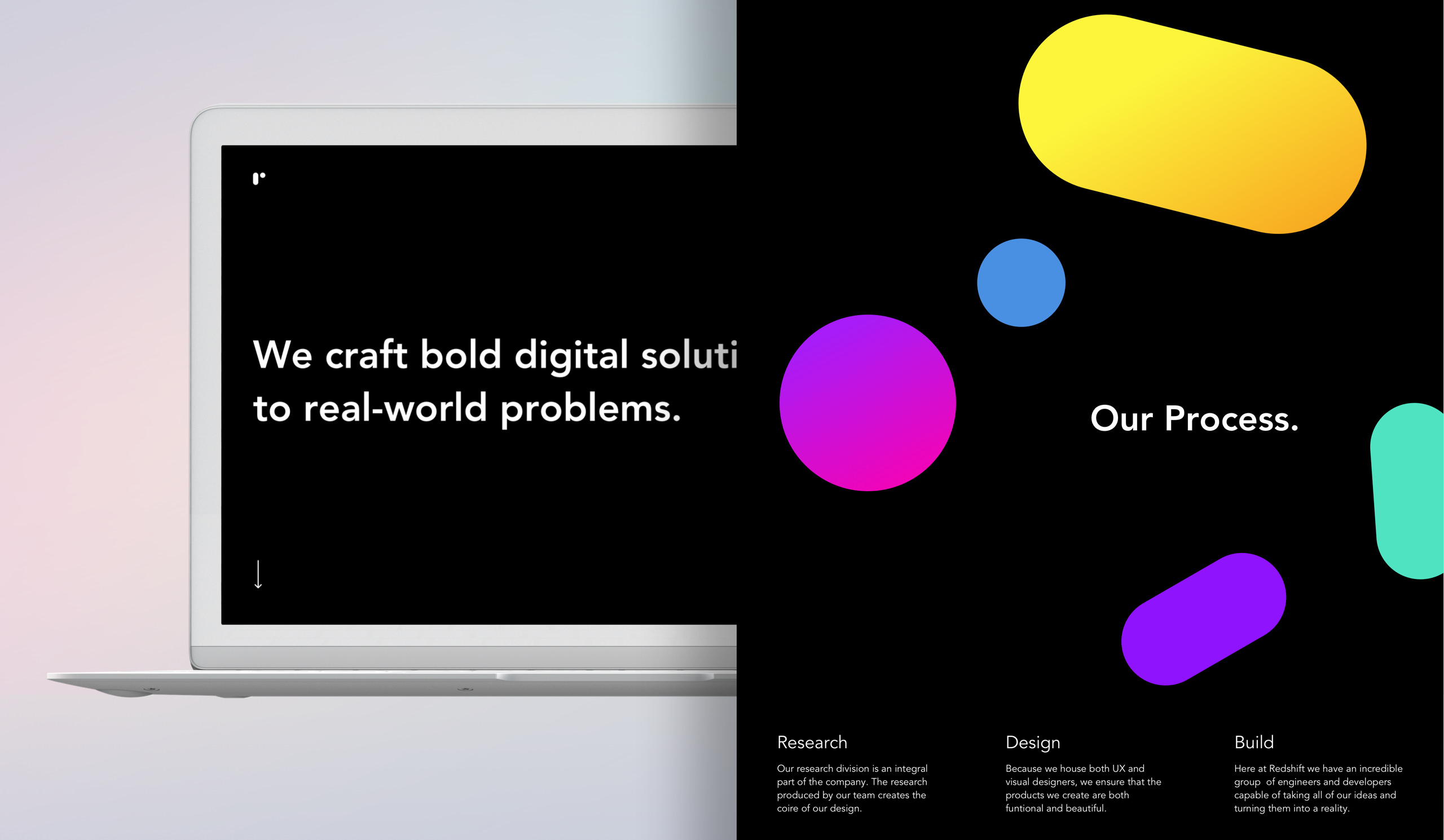
On this project, I led the design explorations and established the new style, ensuring it aligned with the agency’s new brand. My approach of conceptualizing unique monochrome 3D environments for each featured case study on the homepage set a bold direction for the project. Leading a team of designers, I delegated tasks like wireframing, designing interior pages, and creating detailed prototypes. I also worked closely with the development team to optimize website performance. My role was crucial in harmonizing creative and functional elements, successfully navigating team dynamics, and steering the project to meet its objectives within a tight timeline.
Disciplines
- UI
- UX
- Brand
- Visual Design
Skills
- 3D Compositing
- Prototyping
Surfaces
- Desktop
- Mobile
Team
- CEO
- Senior Designer
- Junior Designers
Project Length
- 2 Months
Deliverables
- Market Research
- Design Explorations
- Prototypes
The Problem
The Redshift Agency, despite having a new logo, lacked a cohesive visual style that could effectively communicate the brand image. The primary challenge was to redesign the agency’s homepage in a way that not only showcased their recent work but also distinctively expressed their rebranding. There was a lack of consensus among stakeholders on the desired direction, necessitating the exploration of various design options. Additionally, the project was constrained by a tight timeline, adding pressure to quickly converge on a design direction.
The Results
The redesign, particularly the use of monochrome 3D environments for the featured case studies on the homepage significantly enhanced Redshift’s brand identity, differentiating it in a competitive market. The website’s launch saw a 35% increase in traffic and a substantial rise in user engagement. Internally, the project fostered team collaboration and boosted morale, while my risk-taking in the creative process and decision-making proved to be highly effective. Working closely with the development team ensured the site’s technical optimization, resulting in a fast and responsive user experience.
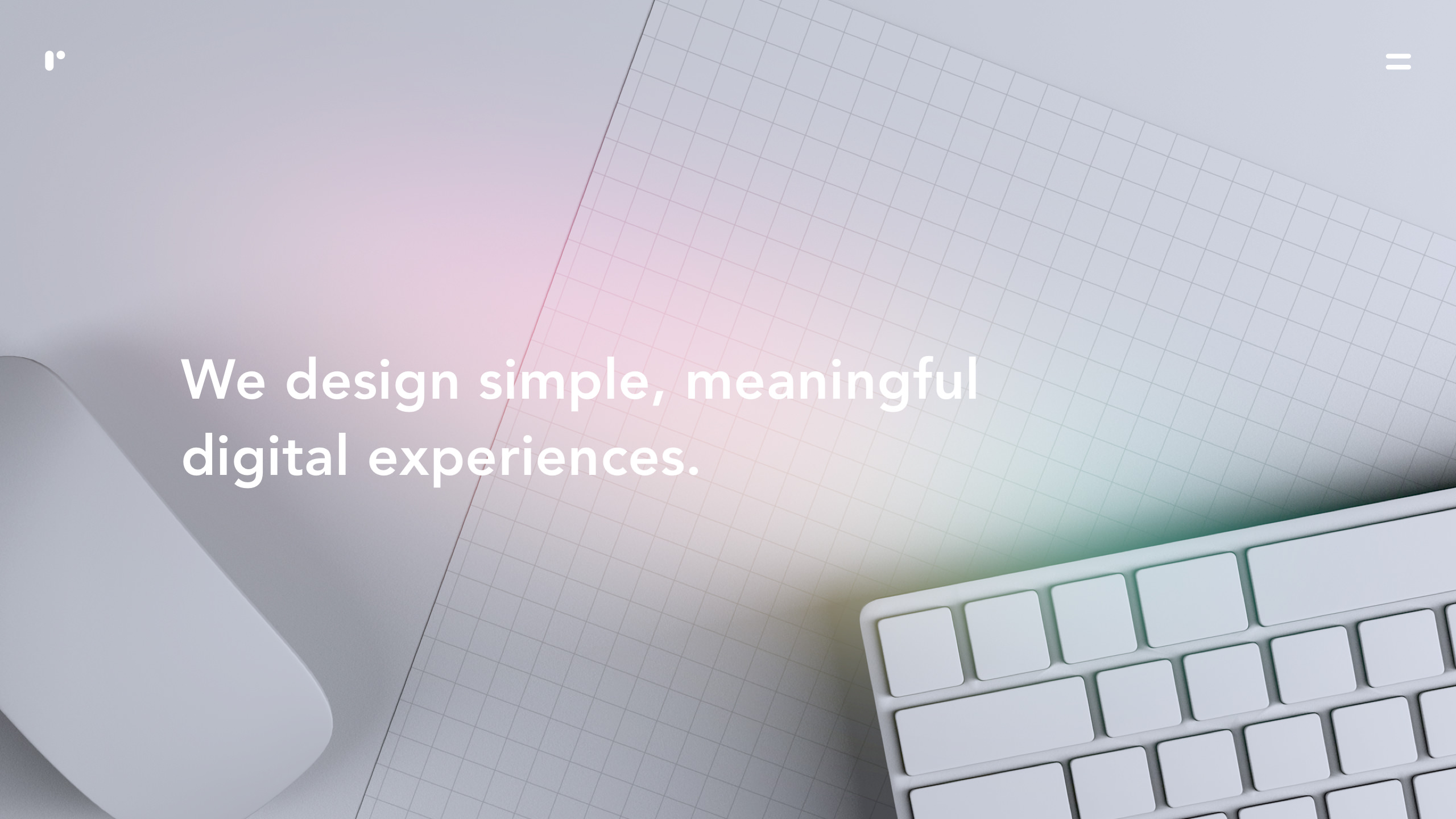
In the highly competitive world of creative agencies, having a distinctive and compelling online presence is crucial. Redshift’s website needed to not just inform visitors about their services but also encapsulate the essence of their brand. The rebranding offered an opportunity to position Redshift distinctively in the market. However, the challenge lay in translating the new brand into a comprehensive visual language that could be applied across the website. The project involved an in-depth exploration of the user experience, starting from flow and wireframes to final design executions.
The objective was to create a website that was not only visually striking but also super usable, reflective of the agency’s design ethos. This entailed considering not just aesthetic elements but also practical aspects such as page load speed, especially given the proposed use of hi-res 3D environments. My role was pivotal in guiding this transition, steering the design team through various phases from conceptual sketches to final execution, and ensuring the project stayed within scope and timeline constraints.
Redshift had recently rebranded themselves and were looking to update their homepage as well. They wanted the new site to show off some new work but also express their new brand. The problem was, they had a new logo, but didn’t have a new visual style established to go with it. They weren’t in full agreement on what they wanted and needed to see some options.
A handful of agency websites were researched, all-in-all about 25 different sites. After some brainstorming sessions and looking at some favorite agency sites, rough sketches were created representing a gross of about 30 unique concepts.
The response from the stakeholders was to simplify the concepts. Entering the visual phase, some simple variations were produced. The stakeholders responded positively to a couple of options but I felt the options they were gravitating towards didn’t communicate their brand very well or make them stand out from other agencies.
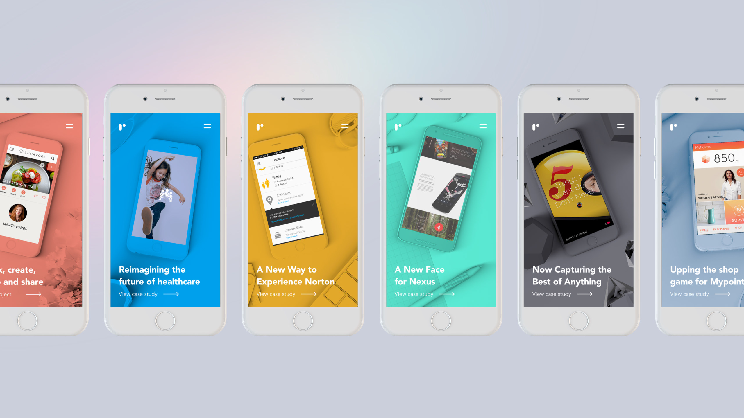
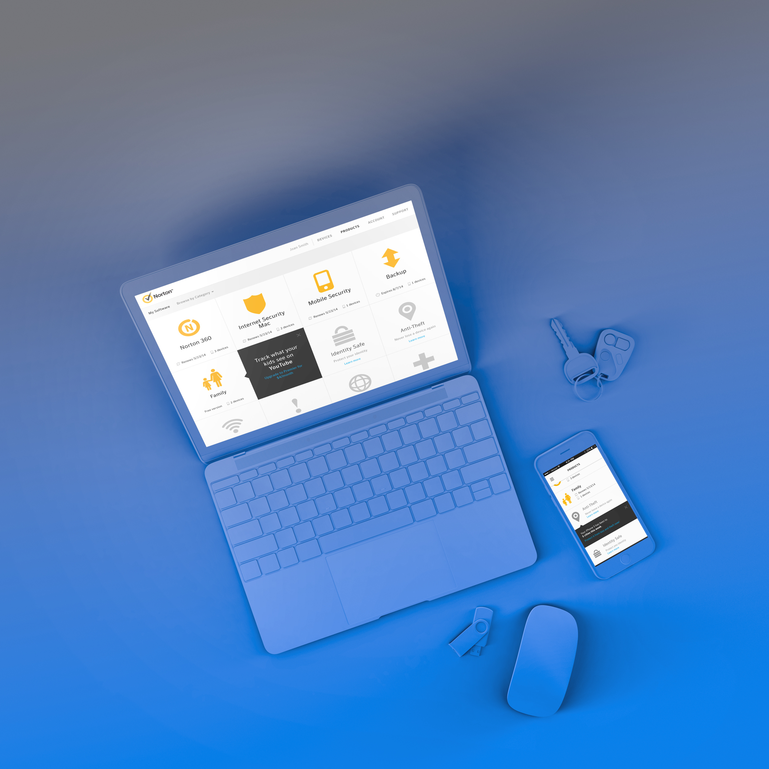
We were running low on time so I decided to take a risk and spend the weekend coming up with a bold new direction. The new brand they were working on utilized a lot of color. I had an idea to create monochrome 3d environments per case study. Each case study feature slide would display a device showcasing the work in the setting the app or website would be used. So for Yumavore, a cooking app for example, the environment would be a monochrome kitchen, etc. The stakeholders and the rest of the team were excited with the direction and I was tasked to bring it to life.
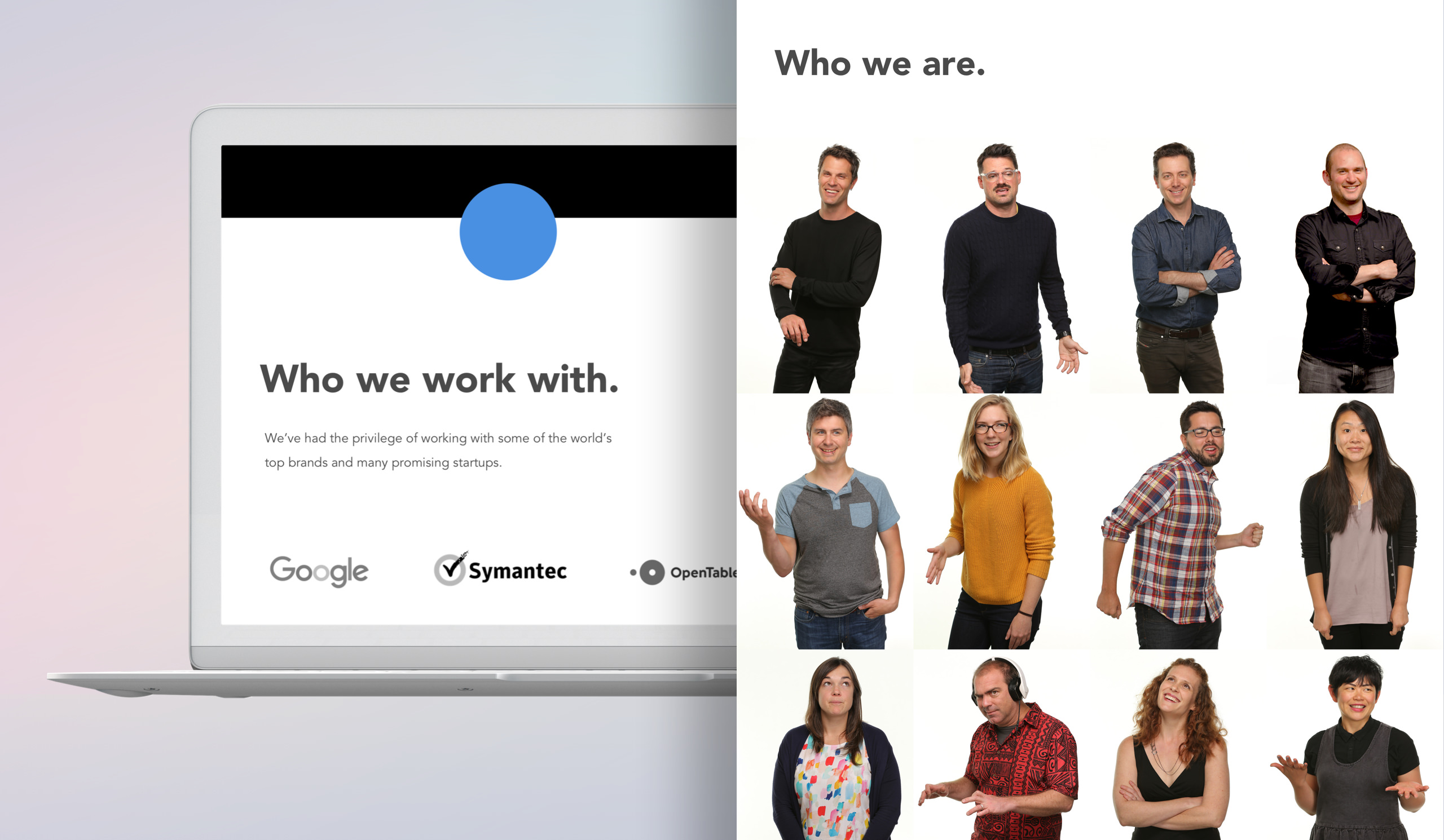
I directed a UX designer to establish the UX for the homepage, case studies, about, and careers pages. I started by sketching a couple variations of the site in pen and paper, and laying them down on the floor so myself, the UX designer, and the stakeholders could get an aerial view and weigh in with feedback before moving to high fidelity. I tasked another designer on the team to start creating the case study pages based on the direction we finalized on paper.
I spent the next week creating the 3D environments and adjusting them with feedback from the creative director. I rendered the scenes in white, and composited them in photoshop with color. Color exploration was tedious and began moving down a subjectivity feedback loop. I took a vote on colors and made a decision based on majority vote in order to stay within scope.
With finalized 3D environments, menu, case study pages, about, and careers pages, I created animated prototypes to demonstrate page transitions etc. I worked closely with the development team to provide optimized image assets so the page would load quickly, which was an important consideration given the size and extent of the 3D environment imagery.