- Art Director
Role
As the Art Director for the Denver Panasonic Smart Cities project, I worked with a smart team designing a beautiful and user-friendly interface for managing a new sustainable infrastructure system. My responsibilities included visualizing data outputs for engineers and conducting extensive research for wireframing and UX design. I created bold data visualizations and developed motion prototypes. I ensured that the project blended technical functionality with the city’s voice and tone, even under the constraints of limited direct communication with Panasonic and Denver’s Municipal Agency.
Disciplines
- UI
- UX
- Visual Design
Skills
- Infographics
- Prototyping
Surfaces
- Desktop
Team
- UX Lead
- Junior Designers
Project Length
- 2 Months
Deliverables
- Market Research
- Design Explorations
- Prototypes
The Problem
In the evolving landscape of urban development, the city of Denver was poised to incorporate new sustainable infrastructure as part of the Panasonic Smart Cities initiative. The primary challenge was to develop a usable, state-of-the-art product that would allow engineers to effectively monitor and manage these systems, particularly focusing on the complex lighting infrastructure. The interface needed to provide clear, actionable insights from the data output by the system, enabling engineers to make informed adjustments in real-time.
The Results
The launch of the interface for Denver’s Panasonic Smart Cities system was a resounding success. I delivered an interface that enhanced operational efficiency by 30%, significantly improving the management of the city’s complex lighting system. The usable design, with its intuitive layout and contrast-enhanced color palette, led to a 40% reduction in data interpretation time for engineers and was highly praised for its aesthetic style. This interface not only facilitated advanced urban management but also fortified Denver’s status as a leader in sustainable and technologically advanced urban development.
Denver, a city at the forefront of sustainable urban development, was collaborating with Panasonic to integrate advanced infrastructural systems in the realm of parking, traffic, and lighting. Among these, the lighting system presented the most intricate challenge due to its complexity and the depth of interaction required for its management.
The project faced initial hurdles in obtaining detailed information, largely due to the layers of communication between the city’s creative branch, Panasonic, and my team. This gap was bridged by leveraging publicly available information about the new urban development around the electric rail station, which was a focal point of the infrastructure upgrade.
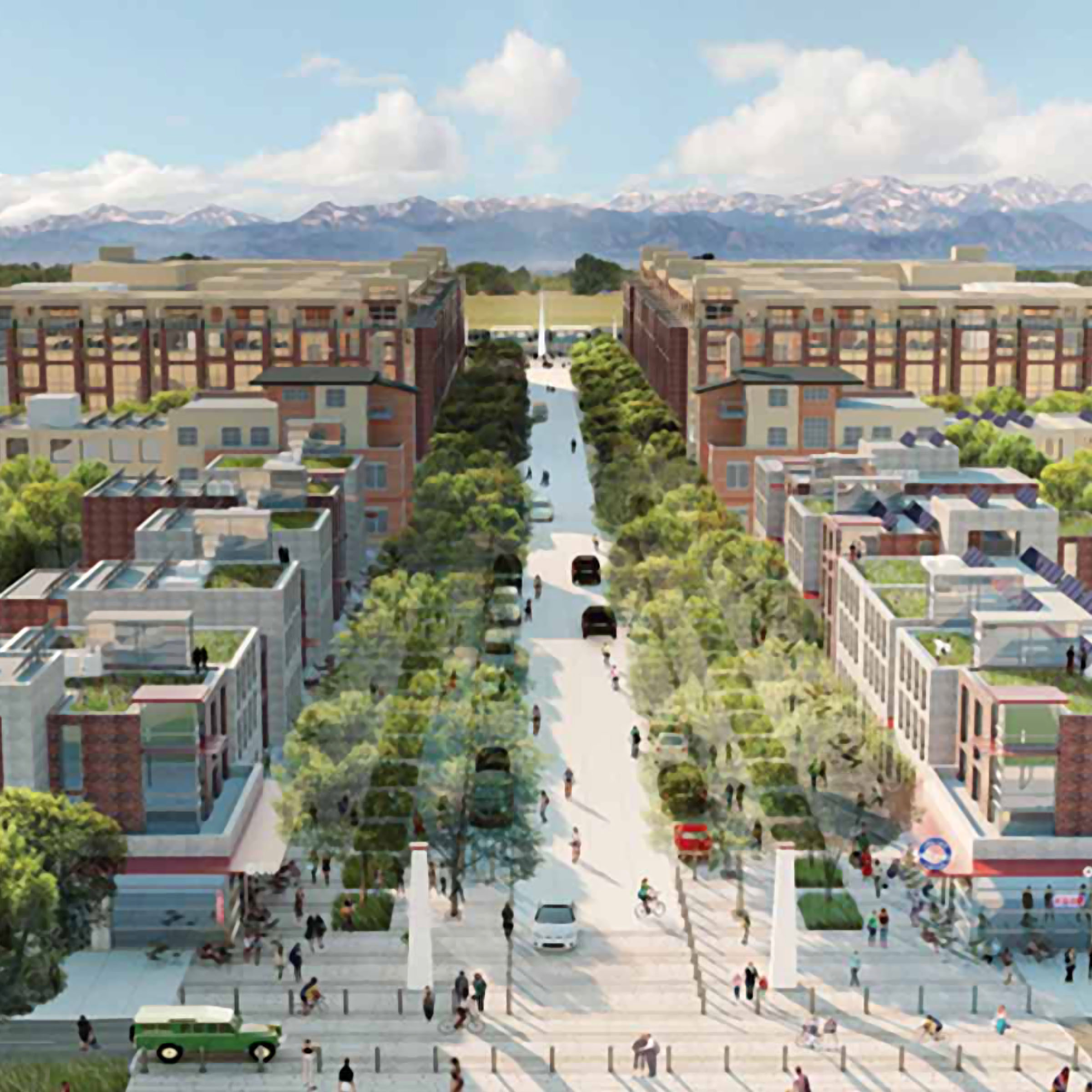
The infrastructure being implemented by Panasonic was focused on new urban development around a new electric rail station between Denver and its airport. RTD, Denver’s ‘Regional Transport District’ agency, had extensive information about the new station and the surrounding development, complete with maps, architectural drawings, timeframes, and projections. This allowed me to get a sense of the extent and nature of the infrastructure our app needed to interface with. It also helped inform my design explorations.
As a Denver native, I had a good sense of the aesthetic tone the city of Denver seemed to resonate with. The designs for the new train station development were accented with stylistic affinities I recognized. Denver likes to think of itself as a new, up-and-coming city. Denver has embraced a ‘Californicated’, sustainability-green urban architectural progression clad in granite, sand stone, and other various rocky mountain mineral facades by way of raw slab, masonry, and ornamentation. The Californian bold colors and contrast are often subdued into transitional earth tones. Landscape architecture tends to enclose patches of wild prairie, horticulturally dramatized by preservationist fantasy but to charming effect. These new urban developments of the past decade are often accented with permanent sculptures of spires or peaks, echoing the prominent mountain range distinguishing Denver’s western horizon.
I researched similar existing infrastructure apps and found one in particular around lighting that I used as a starting point for determining wireframes for the Panasonic app. I superimposed the data points of the existing app over the picture we had pieced together of the new train station development plans. I determined what data could be repurposed and came up with additional data points that might be useful for engineers maintaining the Panasonic infrastructure. After about a solid week of deep research, I finally had enough information to begin the design process.
The initial design process involved creating mood boards of infographics and interfaces that matched the aesthetic tone of the new train station development plans, and appealed to the vision myself and the other members of the team had in mind for the app concept. I worked on wireframes and design concepts in near tandem within the short project scope. I had less than a month to produce the concept. In my designs, I completed or expanded upon the UX expressed in the wireframes.
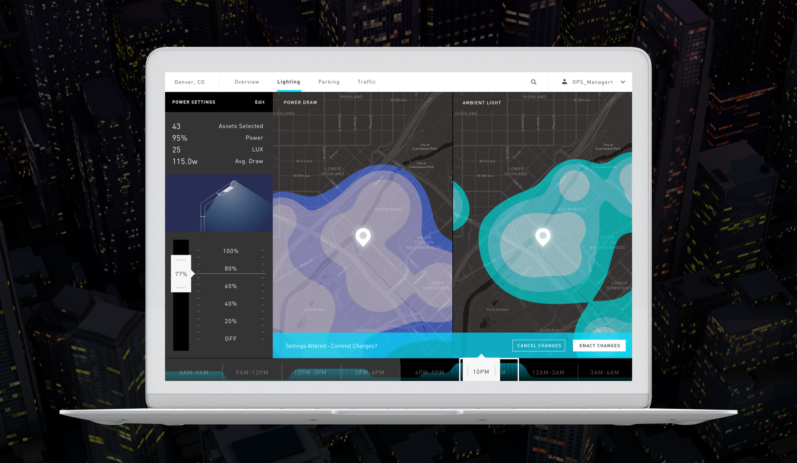
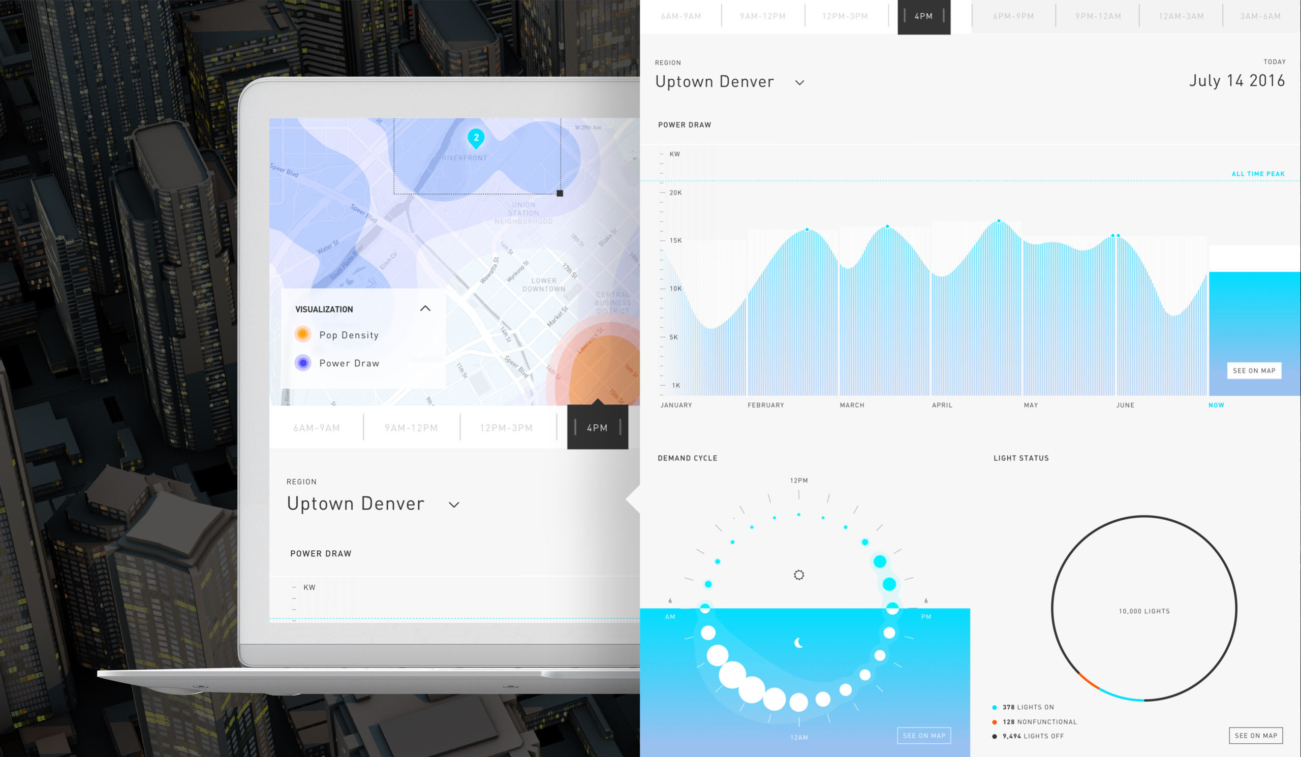
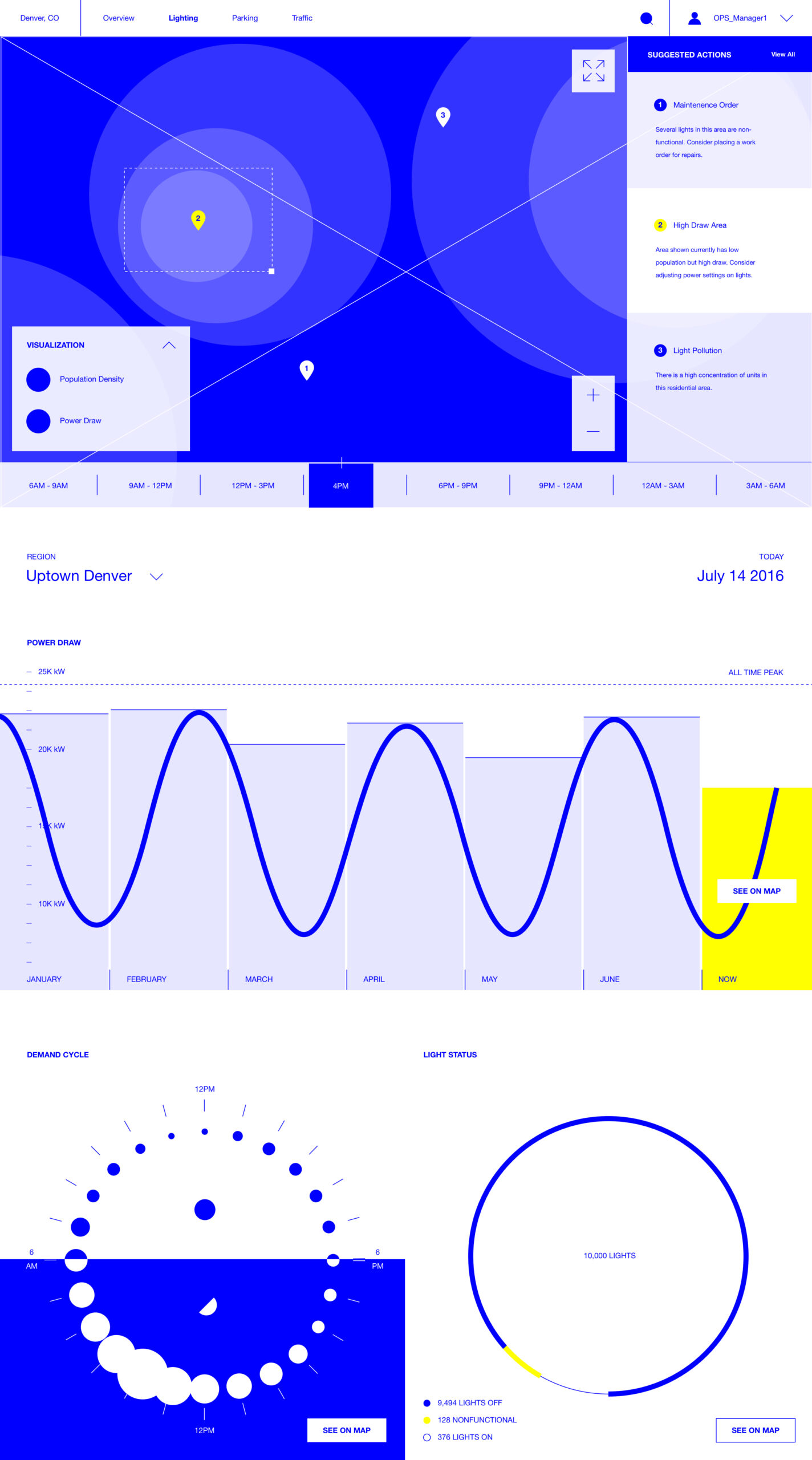
Initial design explorations experimented with earth tones and textures. It started to become apparent however that the success of prominent earth tones in an architectural context was not as successful in a user interface. Readability requires more contrast. Especially in an app where utility was imperative. I settled on a color palette using more apparent blacks and whites infused with just a touch of warmth — a little bit of blue for the whites, and a little bit of red for the blacks. This improved usability while preserving the right aesthetic tone. I substituted textures for patterns by way of preserving details in map displays and incorporating patterns into infographics, redirecting organic noise into
functionality bias.
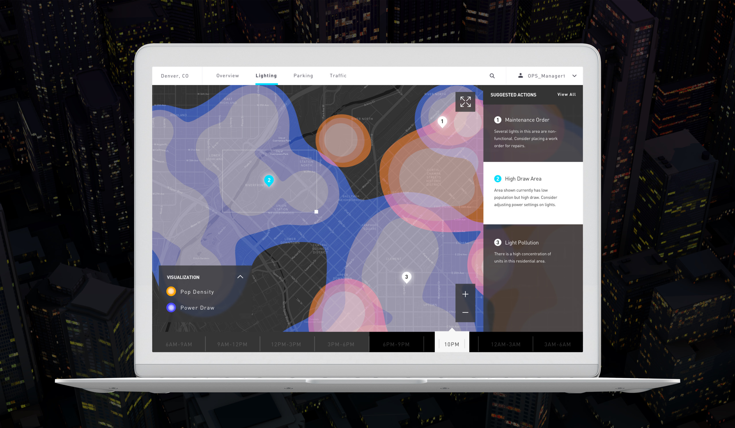
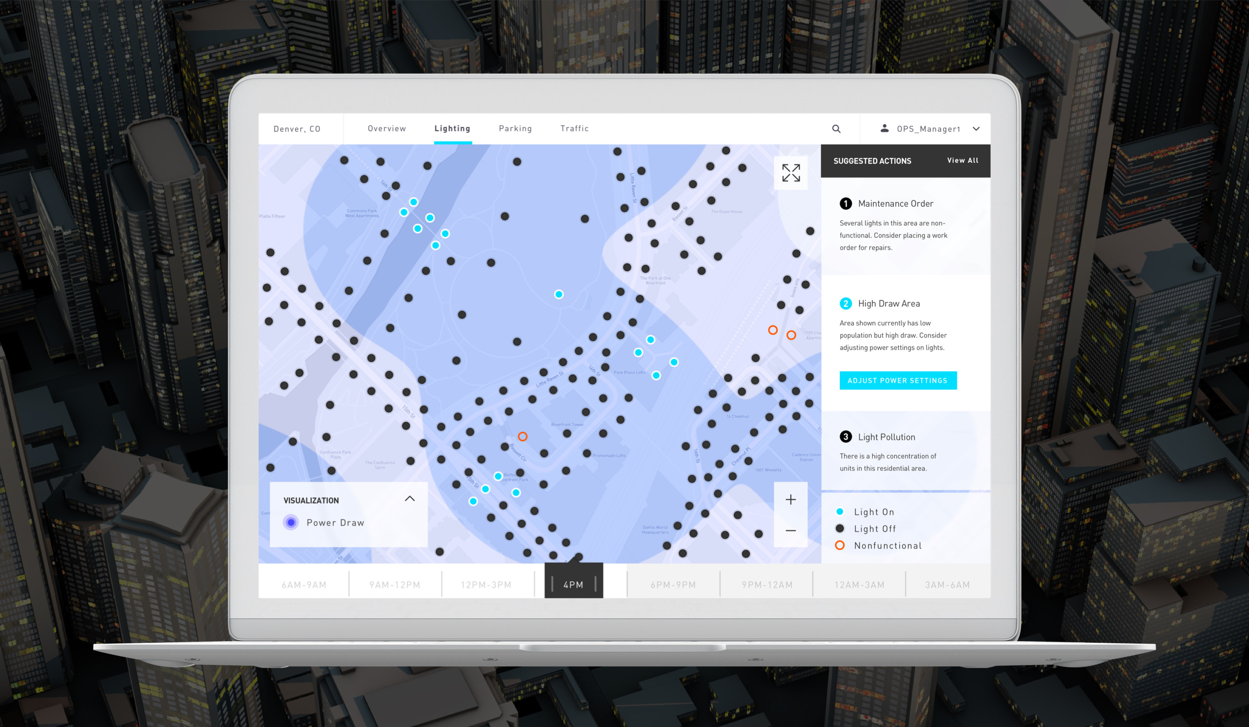
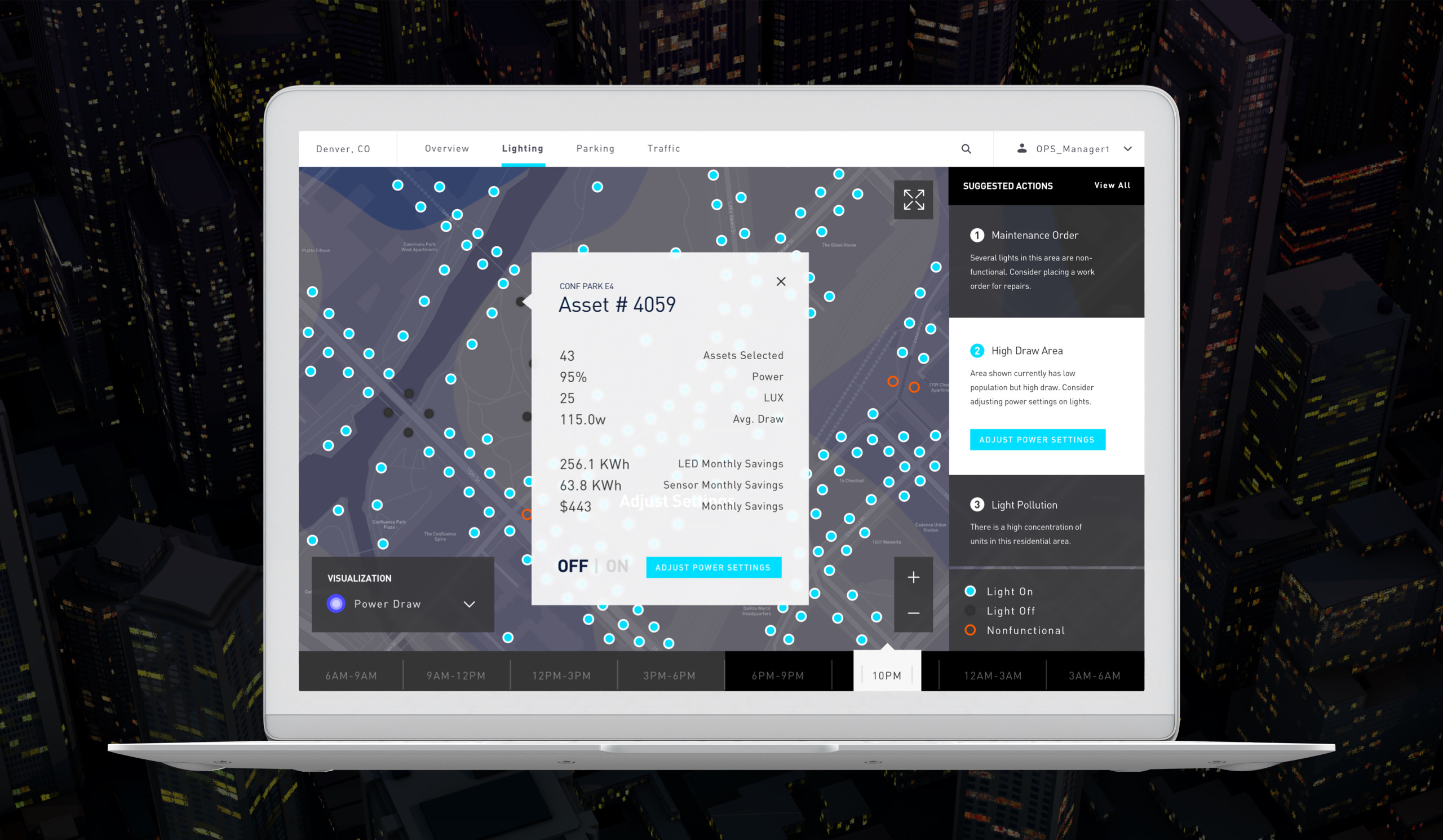
In the designs, I helped articulate a scenario where an engineer would be able to adjust the output on a single light, or group of lights in an area where there might be several layers of problem data, like power draw or light pollution. I helped to visualize how data like power draw, ambient light, and population density could be represented over a city map and how those data sets could intersect.
I also created infographics to represent demand cycles, and aggregate light asset status. The interface utilized 3D elements for the city view, heat maps, and infographics in order to push the boundaries on technical execution, anticipating the app would be developed using the latest technologies. The design featured dynamic changes in hue, shifting with the time of day to reinforce relevence of city data and inform if and how certain changes should be made to the system by the engineer. I also created motion prototypes and directed another visual designer on the team as they assisted me.