
- Visual Product Design Consultant
Role
At Dropbox, I spearheaded the systematization of the company’s marketing assets, guiding a team of designers in creating a scalable ‘Abstract UI’ system. My responsibilities encompassed strategic direction, design exploration, system development, and iterative refinement, all while closely collaborating with the creative director, product system lead, and other stakeholders. I successfully built and implemented a Figma-based library, significantly enhancing design coherence and efficiency across all departments and reducing dependency on external agencies. My role extended beyond design execution to include documentation, knowledge transfer, and post-contract influence, ensuring the system’s adaptability to ongoing product changes and its smooth integration into external partner workflows.
Disciplines
- UI
- Design Systems
- Visual Design
Skills
- Iconography
- Prototyping
Surfaces
- Desktop
- Mobile
Team
- Creative Director
- Brand Studio Director
- Strategist
- Product System Lead
- Senior Designer
- Junior Designers
Project Length
- 18 Months
Deliverables
- Market Research
- Design Explorations
- Design System
- Guidelines
The Problem
The way marketing assets at Dropbox were accessed, used, and produced needed a rethink. The existing assets were painfully inconsistent, with varying treatments of the same asset across different surfaces. This led to difficulties in asset tracking and standardization, impeding the effectiveness of the marketing efforts. Additionally, the transition from Sketch to Figma created a disconnect from the existing system, further complicating the asset management process.
The primary challenge was to design and implement a comprehensive, scalable, and efficient marketing asset system that would address the inconsistencies, adapt to changing design tools and brand guidelines, and ultimately streamline the asset creation process in marketing workflows at Dropbox.
The Results
The design system I led, dubbed the ‘Abstract UI’, transformed the company’s approach to marketing asset creation. It significantly streamlined the design process, ensuring consistency and efficiency across various brand surfaces, and led to a 30% reduction in the time and resources required for creating marketing landing pages. This system reduced Dropbox’s dependency on external agencies, resulting in considerable cost savings, particularly in animation production. Additionally, the work to integrate Dropbox’s product library into the ‘Abstract UI’ system facilitated real-time synchronization of brand and UI updates. Even after my tenure, the system’s legacy continued, evident in its ongoing scalability and effectiveness within Dropbox and its external partners.
Spearheading a new system
When I joined Dropbox’s brand studio team in 2020, my initial role involved assisting with marketing asset production and landing page design. During this period, I observed significant inconsistencies across marketing assets, including variations in the same asset’s treatment, leading to confusion and inefficiency. The challenge was compounded by the shift from Sketch to Figma, rendering the existing asset system obsolete.
My task was to develop a new system that would not only align with the latest product designs but also provide an easy-to-use framework for creating consistent marketing assets. This system was to be developed in Figma to fit with the team’s current toolset.
The goal was to create a scalable and efficient ‘Abstract UI’ system that could accurately represent Dropbox’s product features while simplifying the design for marketing surfaces. The system needed to be intuitive enough for designers to easily select and customize product screens with different content configurations. Furthermore, with an impending product-wide rebrand, the system had to be flexible enough to incorporate real-time brand and UI updates.
Pictured below: actual product UI translated into abstracted UI
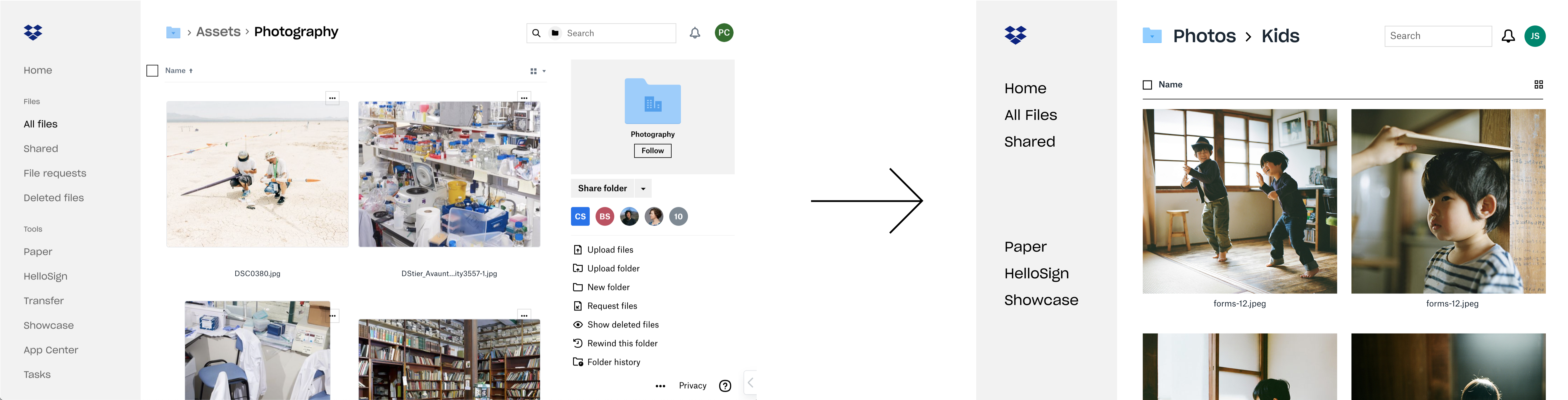
An iteration of a system had already been created by an outside agency in Sketch. Since the team was now using Figma, it was hard to refer to the existing system as a source of truth. Because of this, myself and the team determined that a 2nd iteration with more articulation, and a representation of the latest product design and features, was needed. I helped explore different ways we could abstract the library with an illustration approach, and a more literal, but pared down approach. We centered on the latter, calling it ‘Abstract UI’ (pictured above). At a glance, a user would just assume it’s just a screenshot of the product.
Using the style guide for the full product system UI, we created assets that looked like the product, but with UI details removed. For example, we’d only show one level of nav, or content feeds with larger image thumbnails and only key metadata. I helped come up with rules on how to simplify full product screens into abstract UI that later became guidelines.
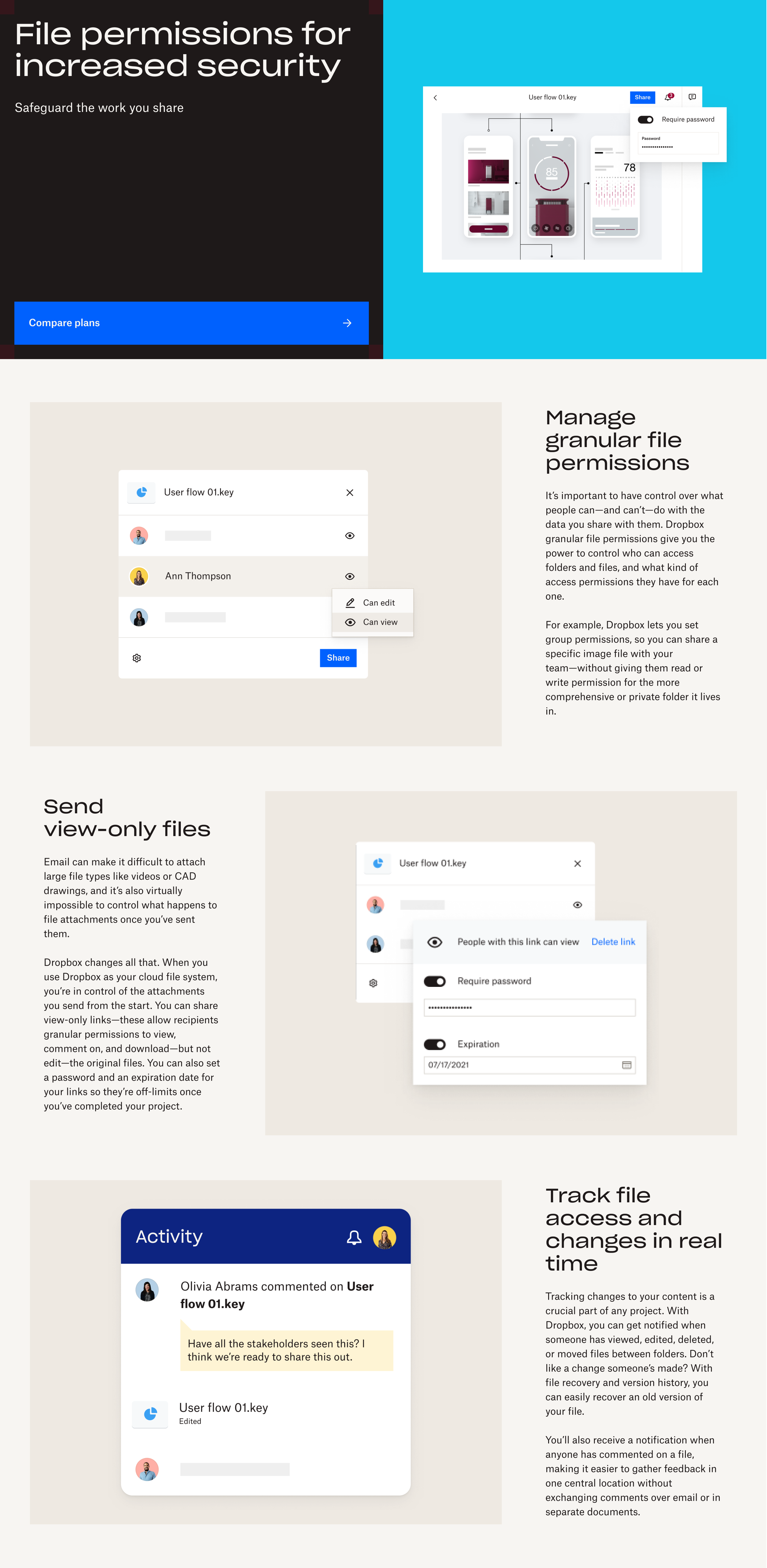
Pictured below: Abstract UI components of a couple main screens showing flexibility via the structure / variant functionality.
With designs and guidelines in place, I started to build out the system. I built the system so it would be easy for designers across the company to choose which screen of the product they needed. I structured it so that each product screen was a component at the top of the system hierarchy. I also wanted it to be easy for designers to choose what content they wanted displayed on the screen. Each product screen component had a handful of variations for different content configurations.
Once the designer had a screen with a content configuration close to what they needed, they could select the content elements, which also had variants, and make granular changes. For example, documents in a feed had variants for each file type.
Pictured below: a look at new Abstract UI product marketing visuals in landing pages created with the new library.
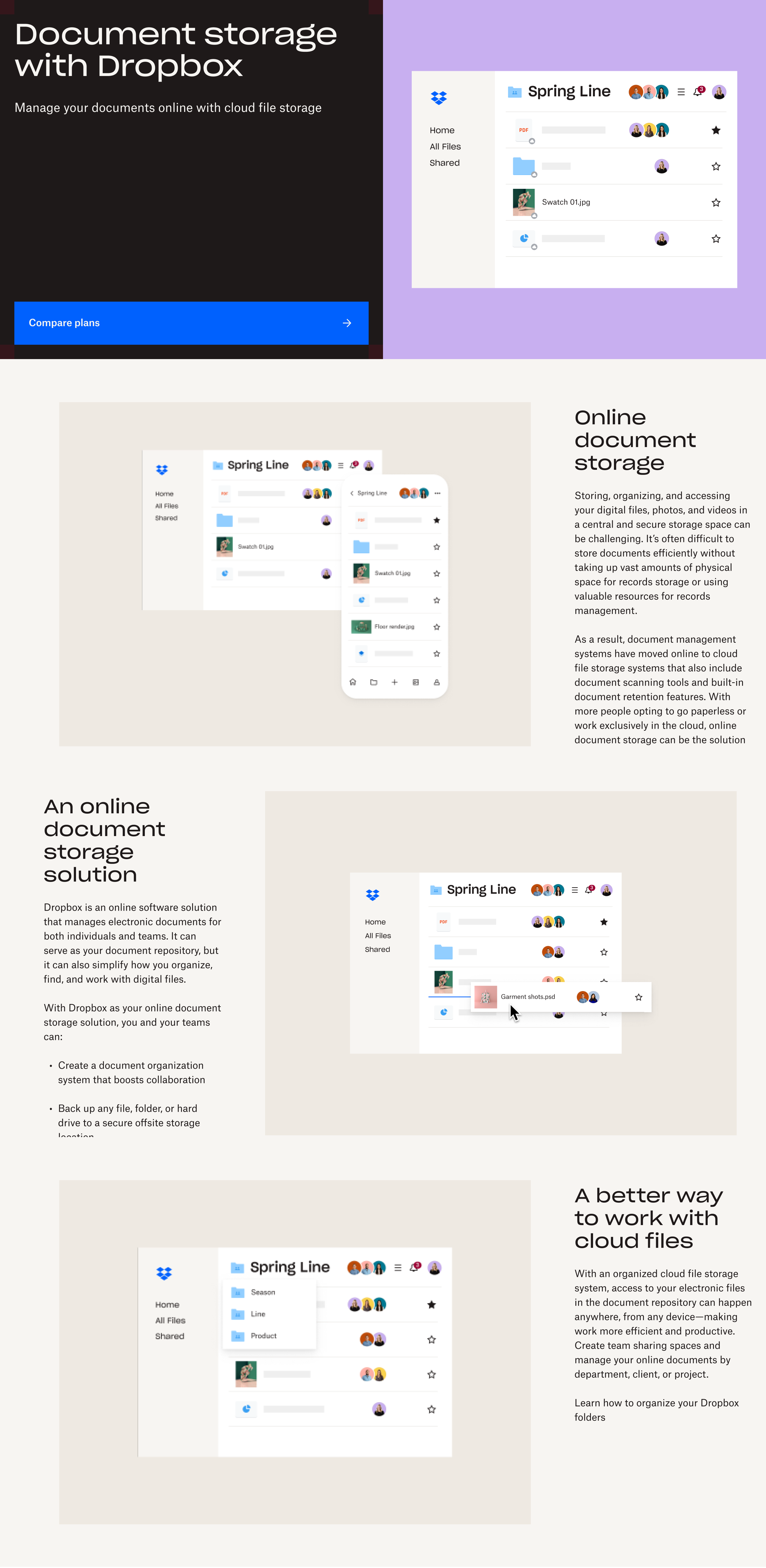
I continued to iterate on the system as new landing pages were created. I built the system in a way so that when new screens needed to be added, or existing screens needed to be updated, the framework of the system accommodated that scaling. During my contract, there was a product-wide rebrand, and so I worked with the product design team to connect the Abstract UI system to as much of the actual product component library as possible, including mostly color, typography, buttons, forms and iconography.
This allowed us to update the Abstract UI system alongside the brand and UI changes being made to the product in real-time. This effort helped to inform documentation I created for other designers on how to use the system elements to create new screens in general, and alongside product changes.
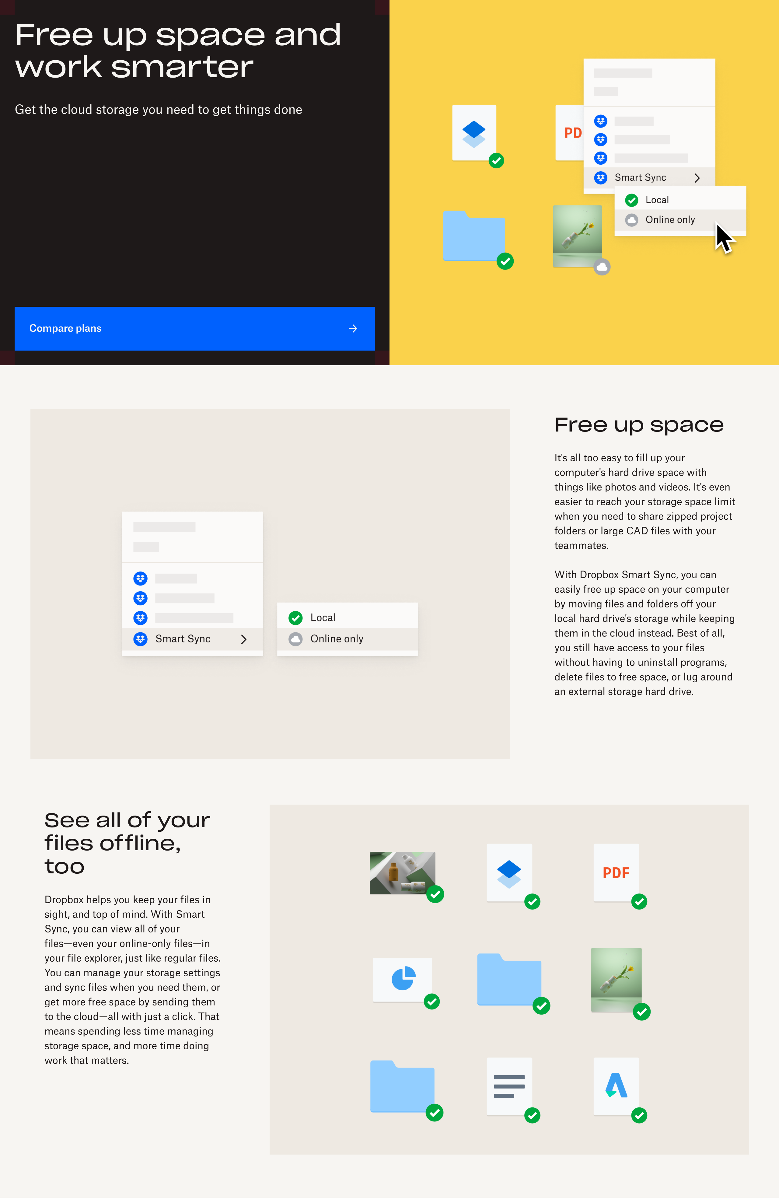
Pictured below: animations created by an outside agency using the Abstract UI library.
30-40% company-wide
project scope relief
Another benefit to the company that this library brought was that it reduced it’s dependency on the outside agency that had created the assets the library would replace. Dropbox was still partnering with this agency to create animations that used abstracted product UI for our landing pages. Historically, part of the agency’s animation deliverable was often creating new assets which accounted for about 40% of the scope. With the new library, most of the scope could be dedicated to animation, saving Dropbox a decent amount of time and money. Company-wide at Dropbox this library removed the need to create new assets, reducing the scope of creating marketing landing pages on average by about 30%.
The following year after my contract with Dropbox had ended, I coincidentally got offered a contract position at Instrument, the very same agency Dropbox partnered with for the aforementioned animations and product assets. I say coincidentally because the recruiter had no idea what my specific role at Dropbox had been, and they had contacted me blind. The project they hired me on for was to help create the storyboards for the product animations for Dropbox’s landing pages. This involved using the library I built at Dropbox. On this project, I was able to help ingest the Abstract UI library as well as Dropbox’s product library into Instruments Figma ecosystem.
Previously Instrument designers had been copy pasting components from Dropbox’s shared Figma space rather than being able to open the libraries within their working design files. Components tend to break when you copy and paste them into a design file from a library directly, so this helped ensure Instrument had the ability to use the components effectively.
Pictured below: assortment of new screens created with the Abstract UI library by Dropbox during my time at Instrument sustained scalability.


I delivered a library that
continues to scale
Given that I had built the components we were using to storyboard the animations, the project went smooth. Instrument proceeded to hire me on for subsequent projects with Dropbox at different points of the year. This gave me an opportunity to see that the library at Dropbox was continuing to scale as they made product changes, which was reflected in their library without the library breaking or degrading.