- Art Director
Role
As the Art Director for the Symantec Newsroom project, I played a crucial role in redefining its information architecture and style in close collaboration with the lead strategist. My responsibilities included executing a branded responsive design and directing a team of designers to ensure consistent visual language. I developed a tile-based, responsive UI, incorporating the pixel motif focal to Symantec’s brand. My engagement with stakeholders through presentations and feedback sessions was key to aligning the design with business objectives. I ensured the scalability of our design would adapt to future content and device requirements.
Disciplines
- UI
- Visual Design
Surfaces
- Desktop
- Mobile
Team
- Lead Strategist
- Junior Designers
Project Length
- 2 Months
Deliverables
- Market Research
- Design Explorations
The Problem
Symantec, a global leader in cybersecurity, faced some challenges with their online newsroom. The existing interface, over a decade old, was outdated, unbranded, and not optimized for current web standards. It consisted merely of a simple, text-heavy, three-column list of links, lacking essential features such as social sharing functionality and mobile responsiveness. Symantec needed a total overhaul of their newsroom, not only to incorporate their current branding but also to enhance user engagement with up-to-date, visually appealing, and easily navigable content. The goal was to transform the newsroom into a dynamic, branded space where users could effortlessly read, filter, and share a growing archive of articles about emerging viruses, malware, and company news.
The Results
The redesign led to substantial improvements, marked by a 40% increase in user engagement and a 30% rise in average site duration. The responsive, tile-based layout with a masonry-style design, integrating the brand’s pixel motif, improved navigation and content discoverability. This overhaul significantly boosted Symantec’s brand consistency and recognition. The introduction of social sharing functionalities led to a 70% increase in article shares. The strategic presentation of content, in collaboration with the lead strategist, reduced bounce rates by 35%, showcasing the project’s success in meeting its objectives and enhancing Symantec’s digital presence with a scalable and future-proof design.
In the rapidly evolving field of cybersecurity, staying up-to-date on the latest threats is crucial. Symantec’s existing newsroom did not reflect the company’s status as an industry leader due to its outdated design and lack of features. The project involved not only a redesign to align with Symantec’s brand identity but also a strategic restructuring of the information architecture to improve content discoverability and engagement.
My role entailed working closely with the lead strategist and a team of designers to create a coherent, branded, and responsive design that catered to the needs of internal stakeholders, journalists, and the general public seeking cybersecurity insights. The challenge was to infuse Symantec’s brand identity into a revitalized interface while ensuring the newsroom’s design was adaptable to various types of content and accessible across different devices.
I worked with the lead strategist who was working with other key stakeholders to nail down what content we wanted to show and roughly where. I went through their existing newsroom and got a feel for the kind of content it was comprised of, identifying if it had images or not, etc., in order to start thinking of ways to present the content.
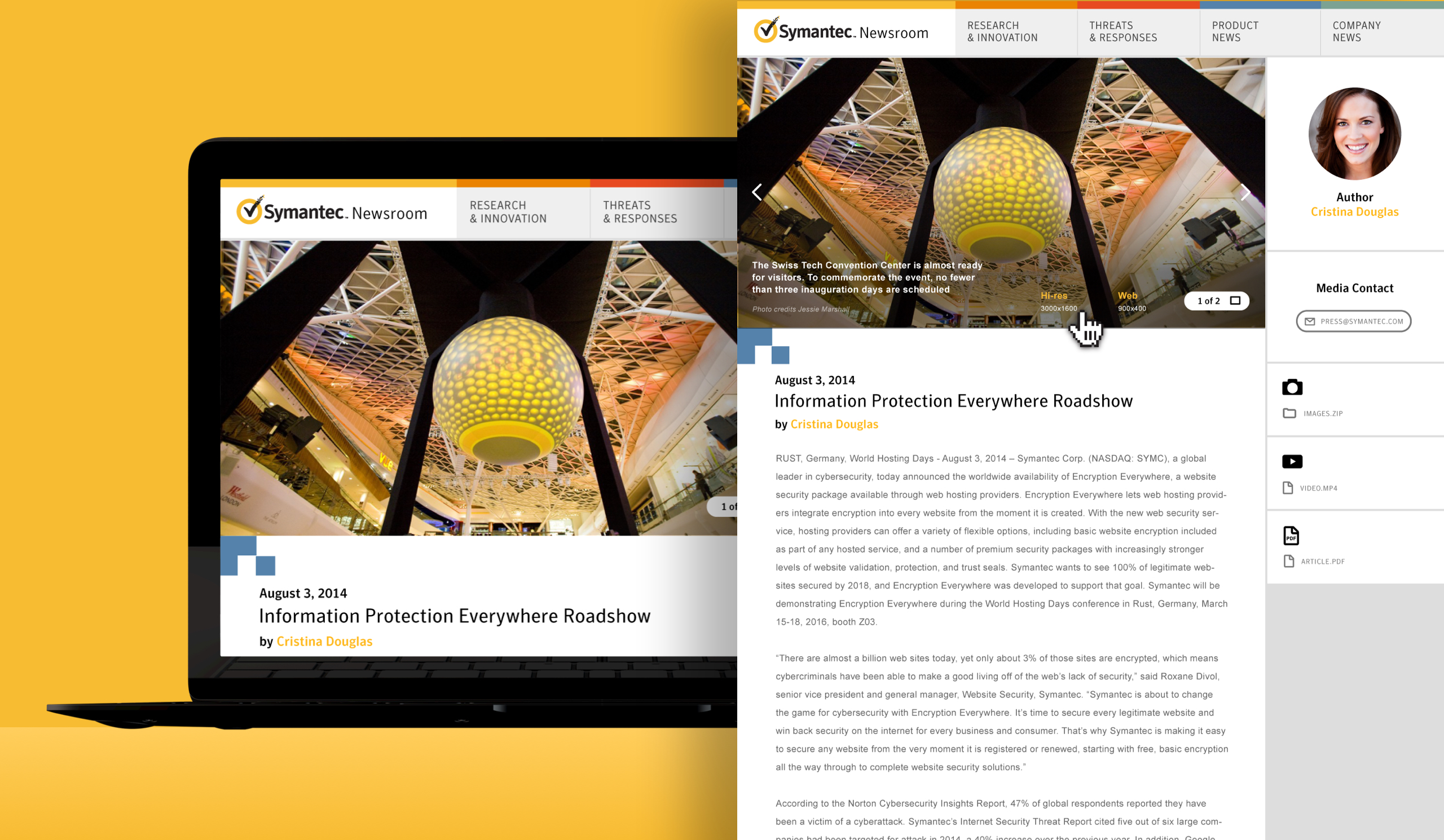
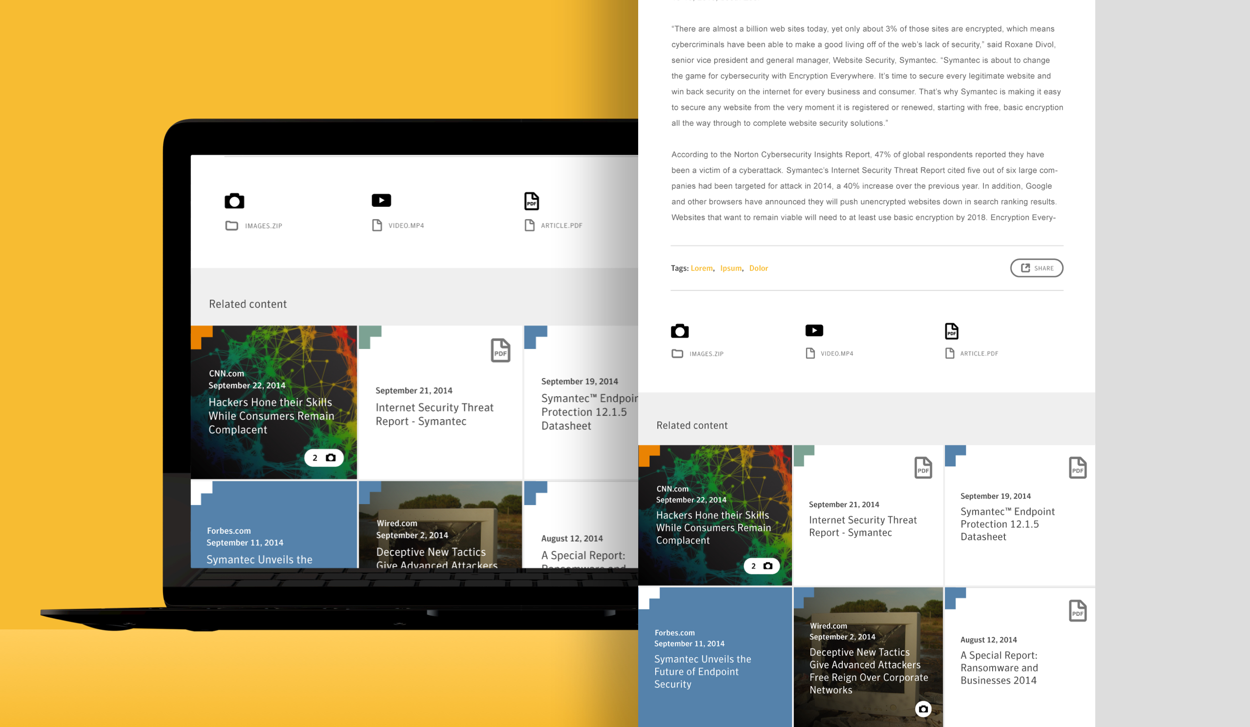
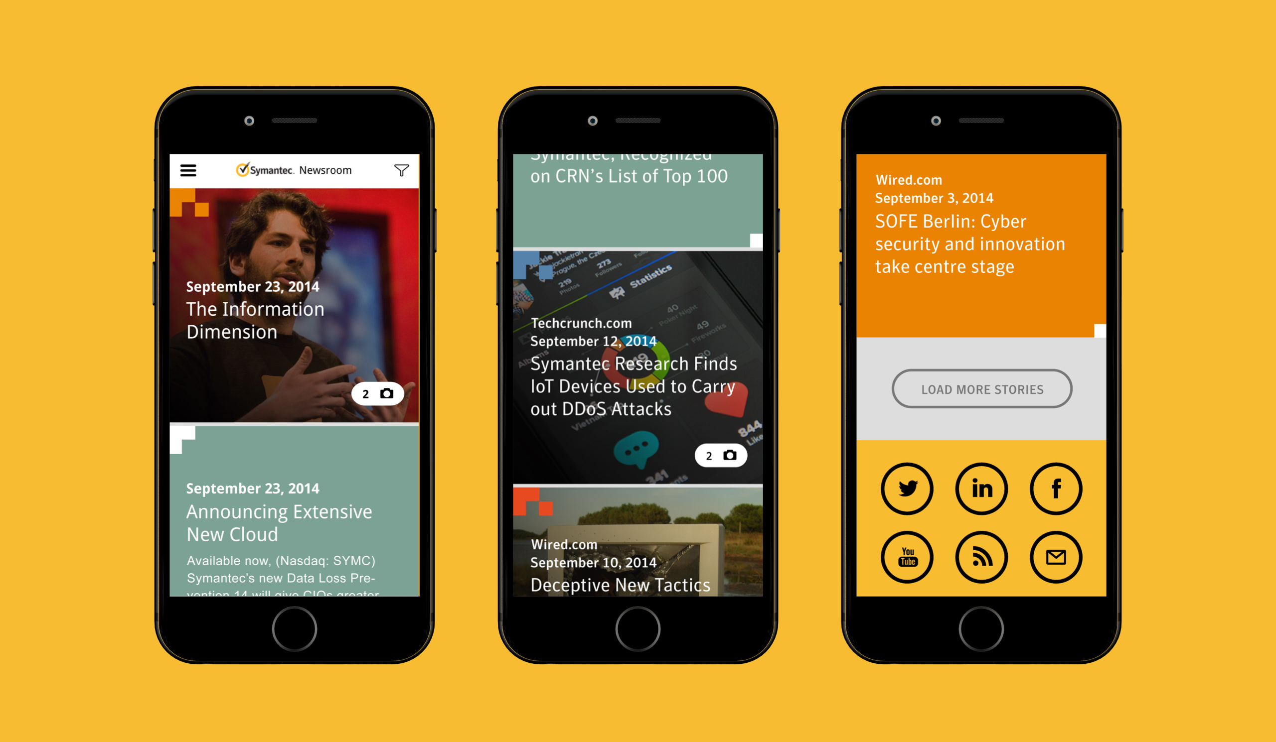
Starting with the homepage wireframes from the IA, I did 3 variations on aesthetics, content organization, and interaction. In each, I stripped the text down to headlines and brought images into content modules. For articles without images, I used a solid color as the bg, taken from the styleguide color palette and corresponding to the category the article was under. All modules, image or not, had a category color treatment. I integrated brand elements throughout, which served visually as well as functionally. I presented these variations to stakeholders.
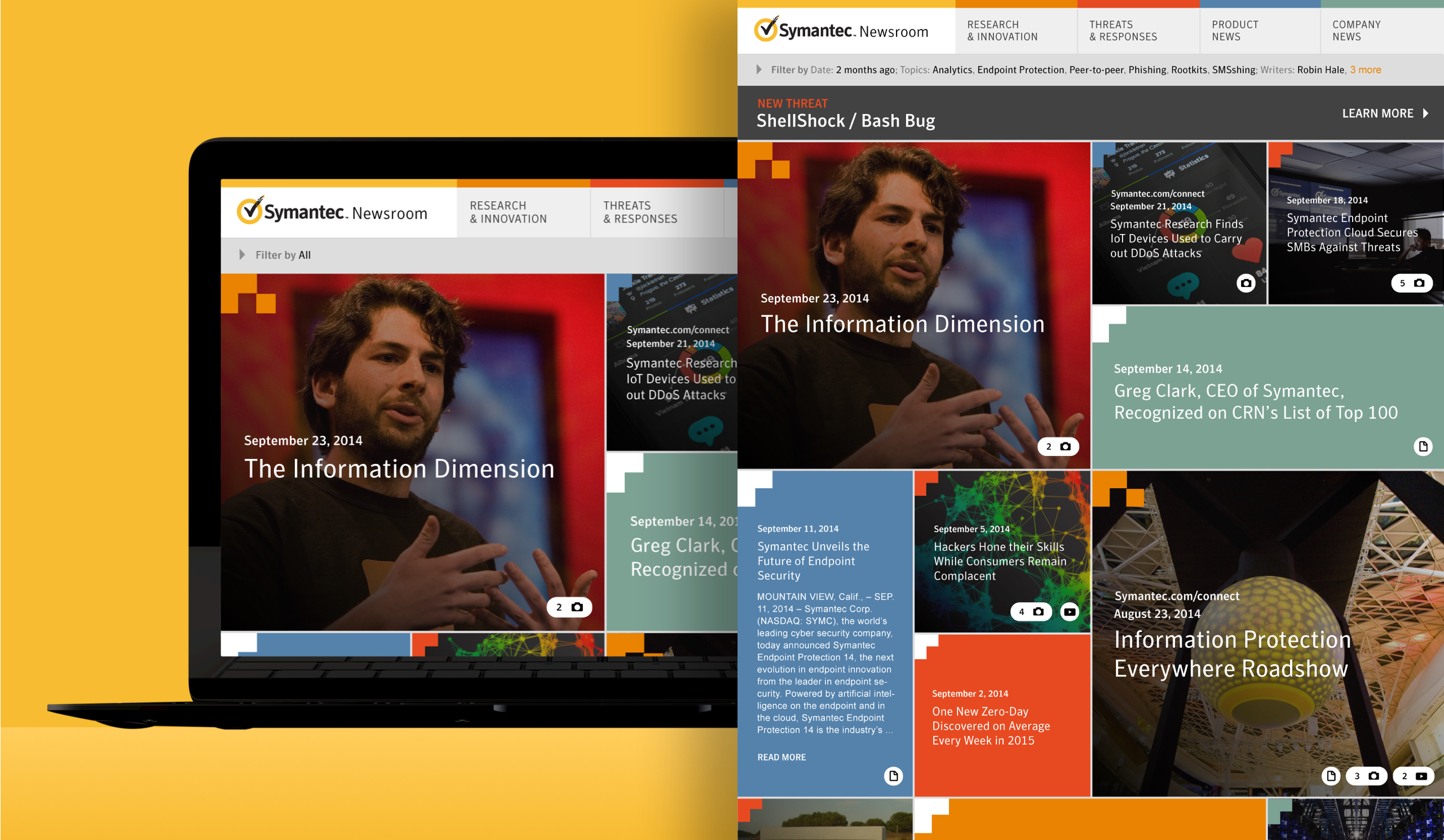
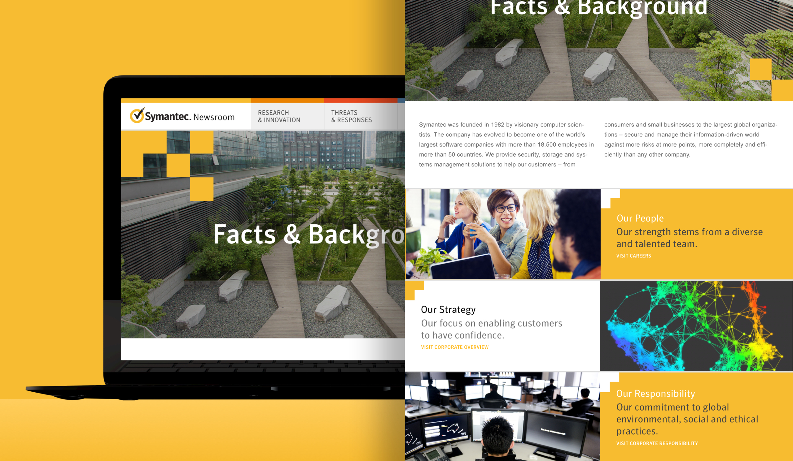
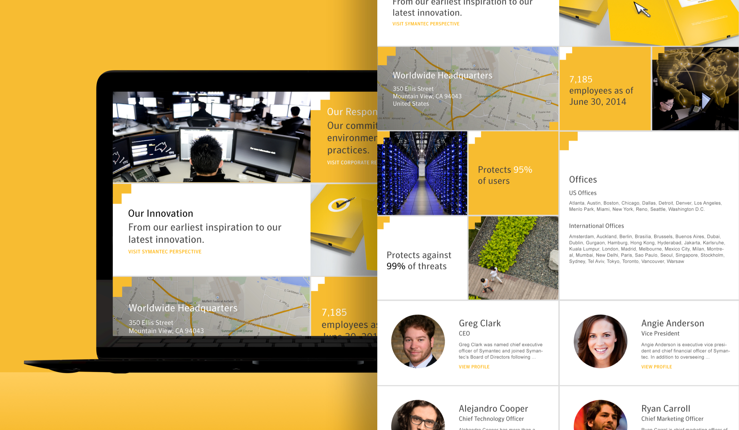
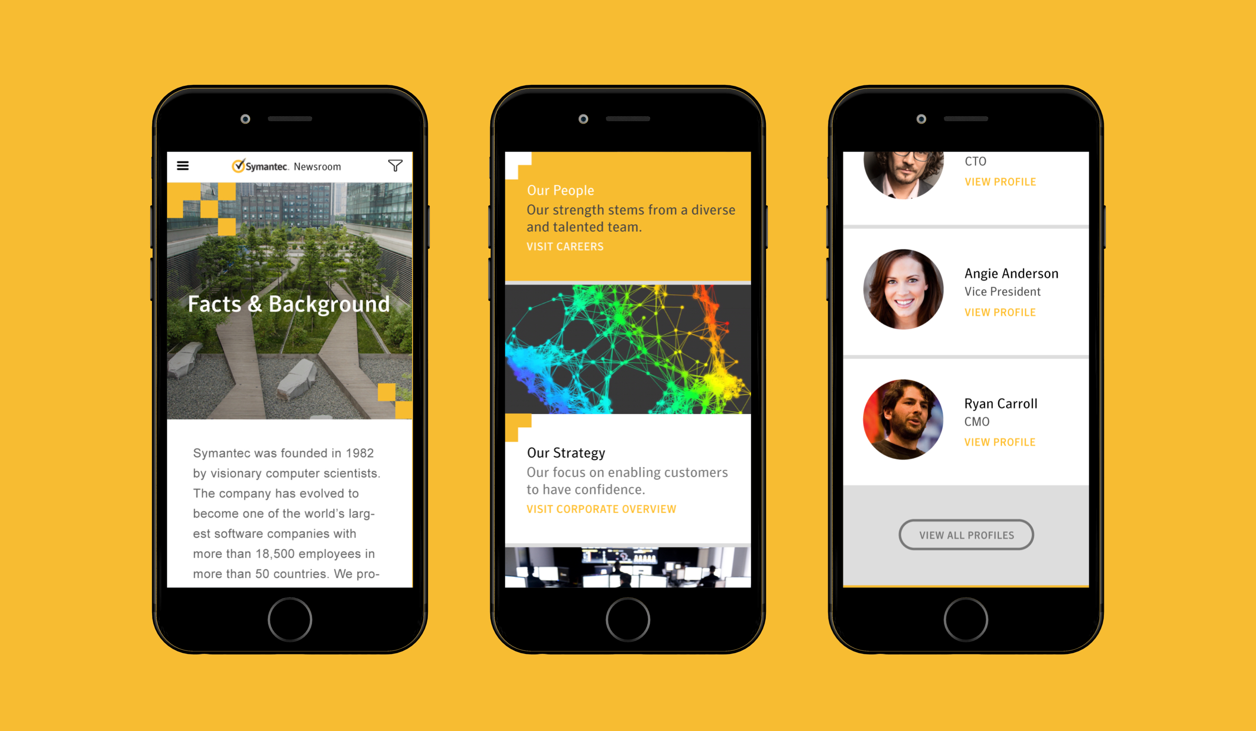
In the chosen direction, UI elements would be broken into responsive tiles. The first consideration was branding. The primary motif in the Symantec branding materials was a randomized cascade of yellow ‘pixels’. This motif was taken from the pixelating checkmark of their logo mark. This motif was incorporated onto feed tiles to color-code them per category. The home page would be a feed pulling from all categories, and the links in the top nav would be for each one, effectively acting as a filter. The tile layout for all of the elements echoed the yellow pixel brand motif, saturating the updated newsroom with their newer brand. This would also give the site break-articulation and, with a masonry layout, add heirarchy to the articles. Extending the tiled style throughout, even to non-feed pages like about, would give the site a strong consistent visual language and a bold distinct look.
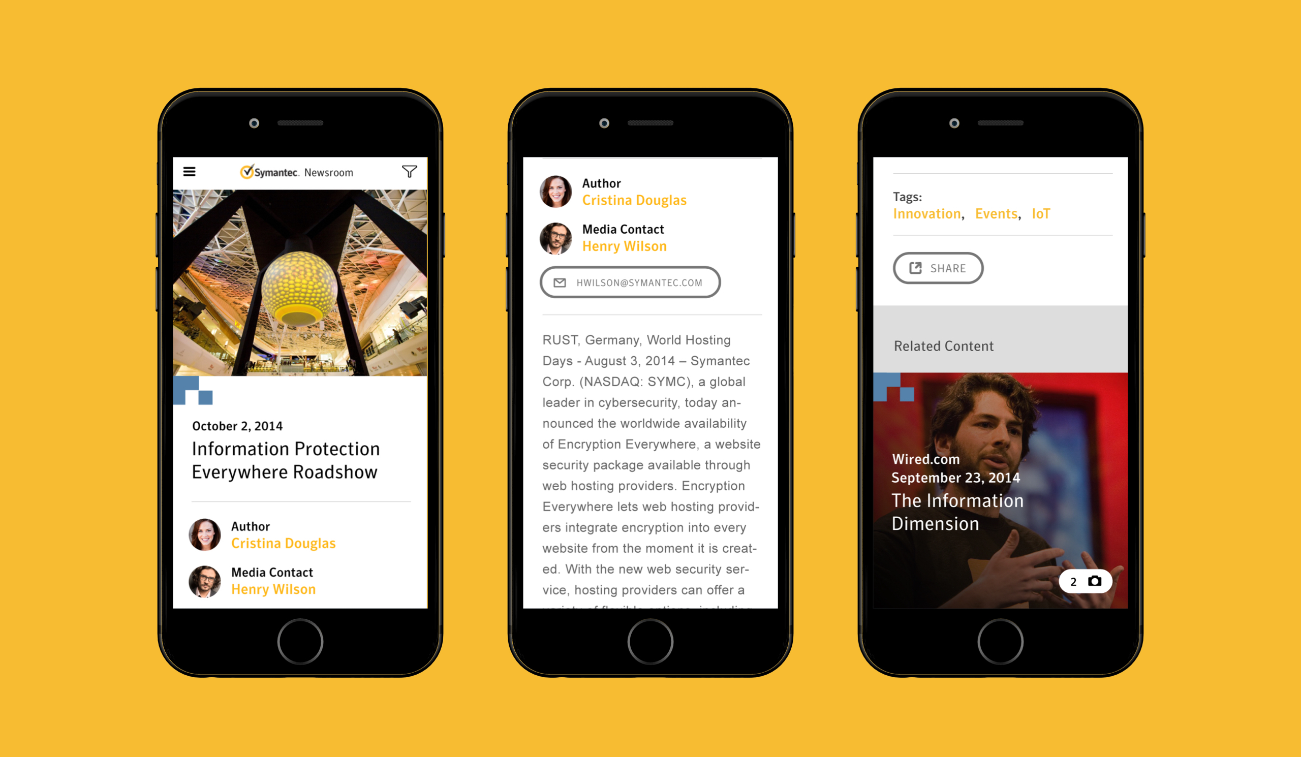
I applied the masonry-style layout to the article (interior) pages. I used the same four column grid across every page template design for consistency, responsiveness, and style. The brand element I chose represented pixels, data, information, so I wanted to use a pronounced grid to incorporate the brand into the user experience. I made sure a fully branded experience would scale well across categories, different kinds of content, on different devices, and anticipate pages to come.